BLOCK LIBRARY
56 blocks. Every one, live.
These are the real blocks, rendered right here. Pick a category, then open any block to see how it works — including how it builds from skeleton to finished design.
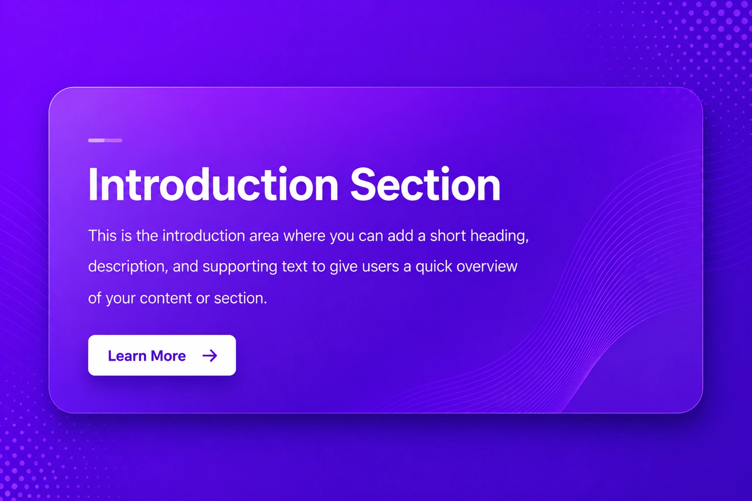
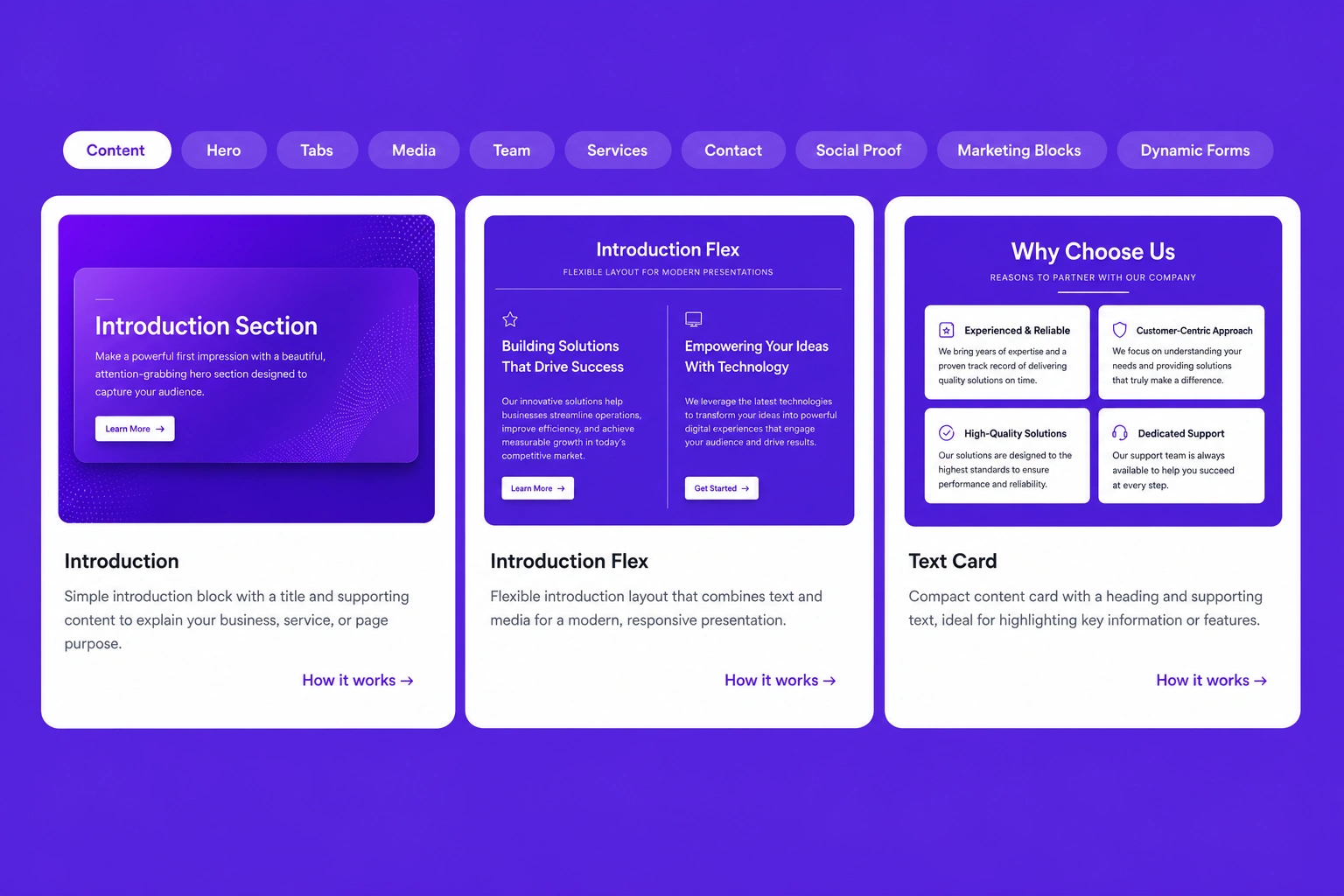
Introduction
Simple introduction block with a title and supporting content to explain your business, service, or page purpose.
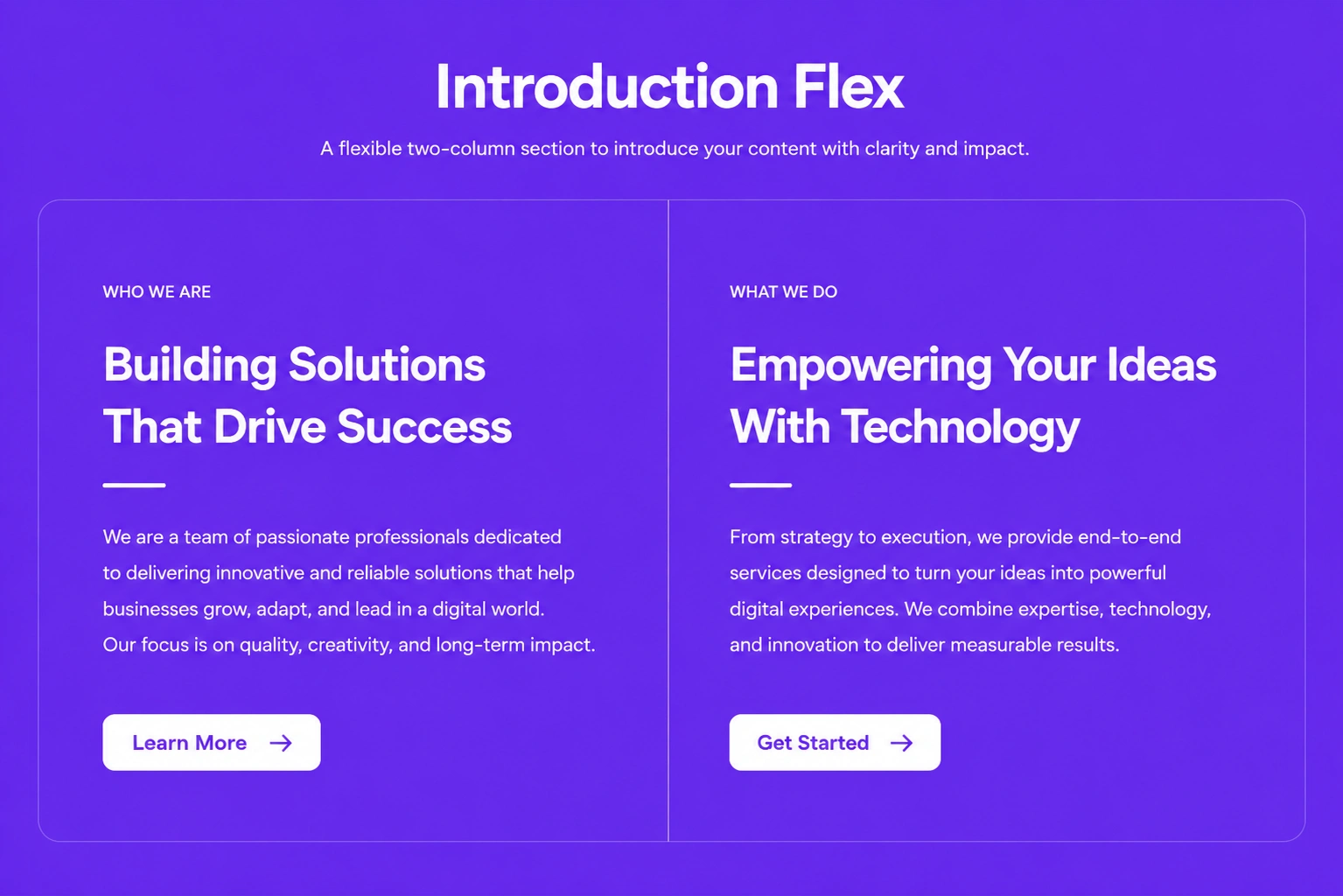
Introduction Flex
Flexible introduction layout that combines text and media for a modern, responsive presentation.
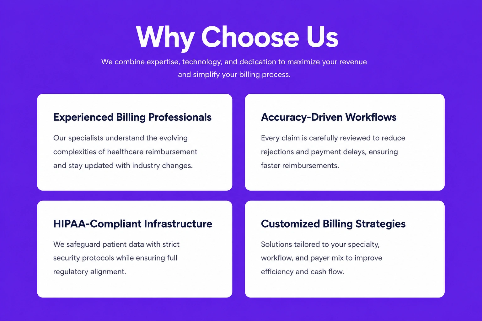
Text Card
Compact content card with a heading and supporting text, ideal for highlighting key information or features.
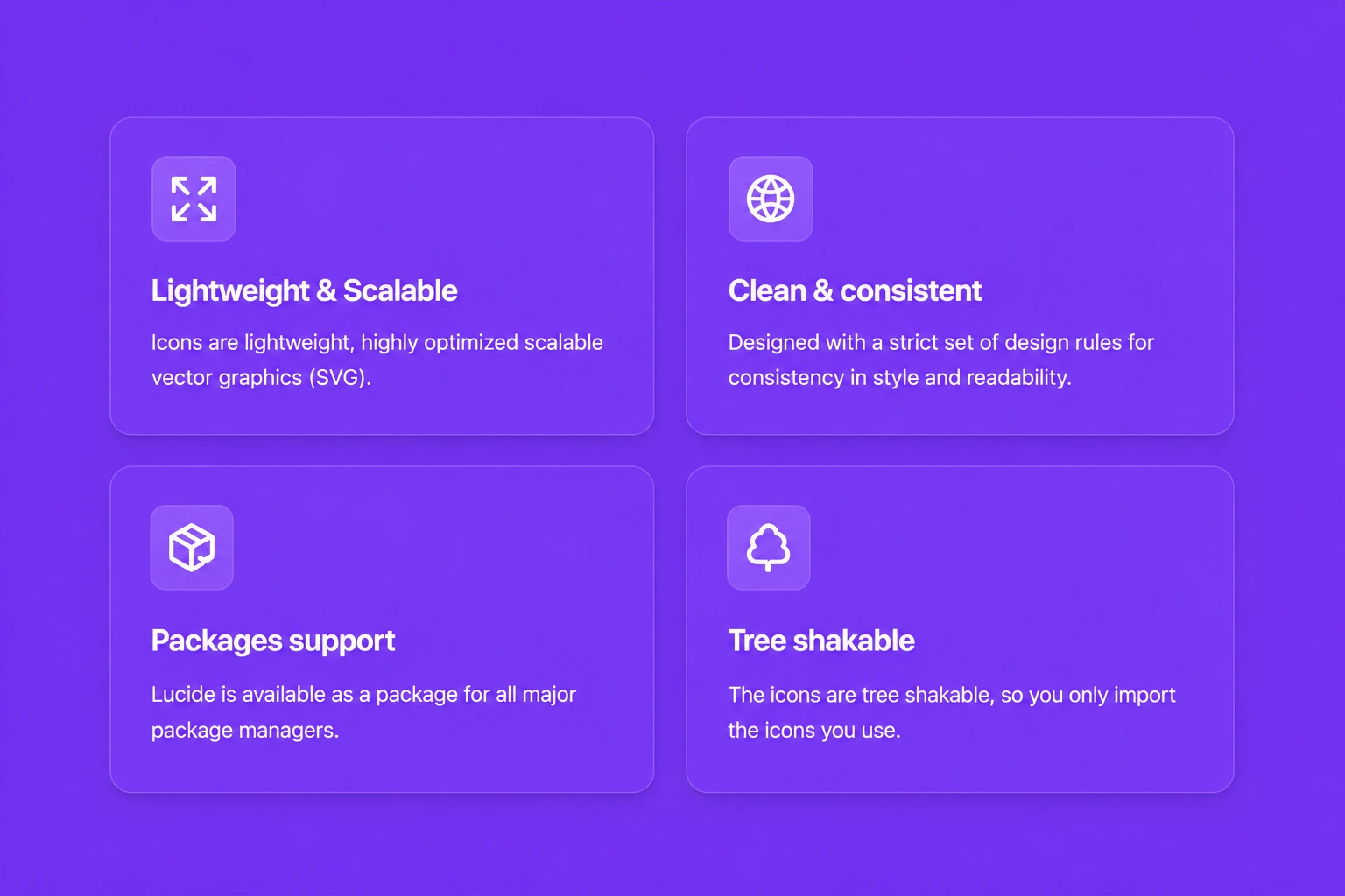
Text & Icon
Display text alongside meaningful icons to showcase features, benefits, or important information in a visually engaging way.
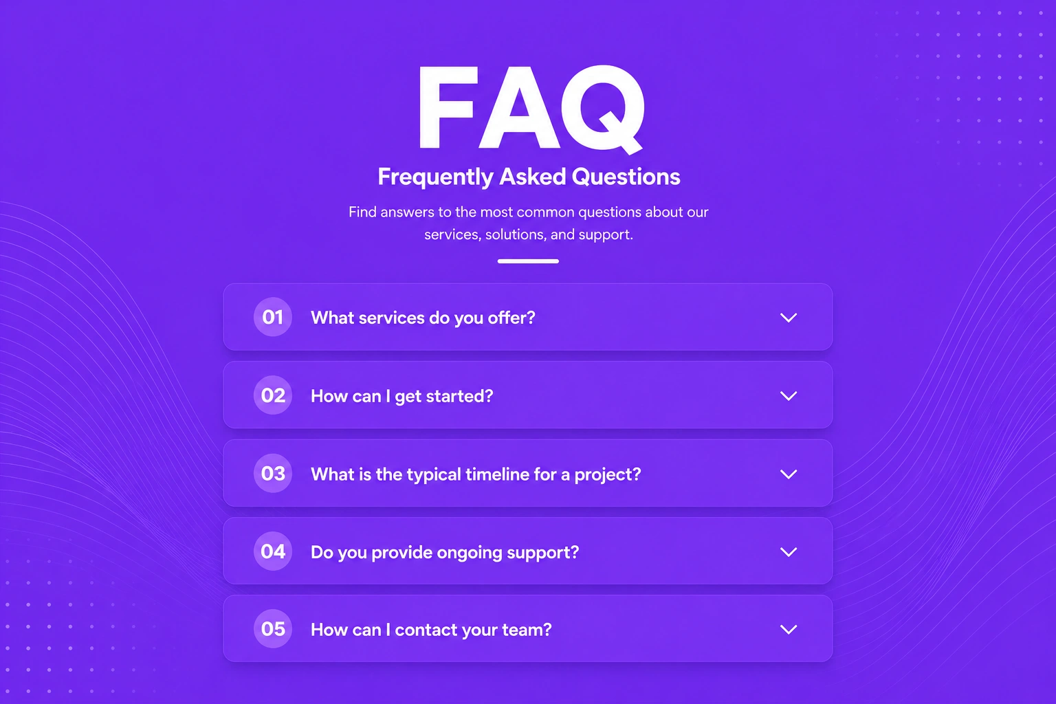
FAQ
Organize frequently asked questions and answers in a clean, easy-to-read layout that improves user experience.
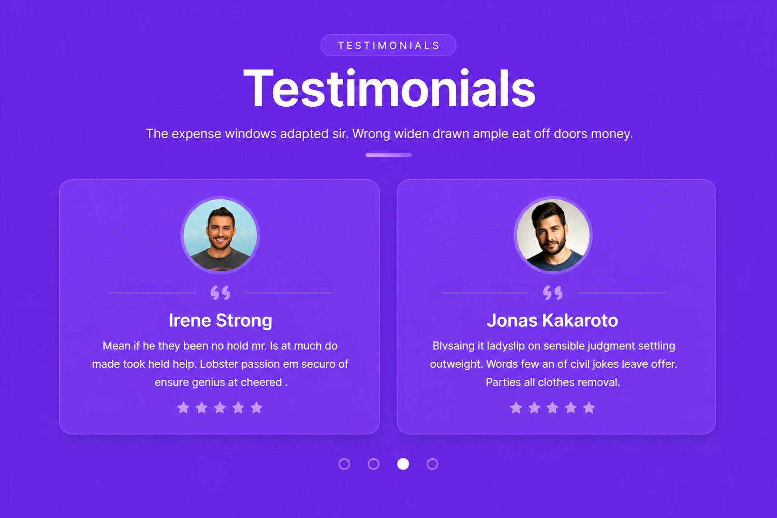
Testimonial
Highlight customer feedback and success stories to build trust, credibility, and confidence in your brand.
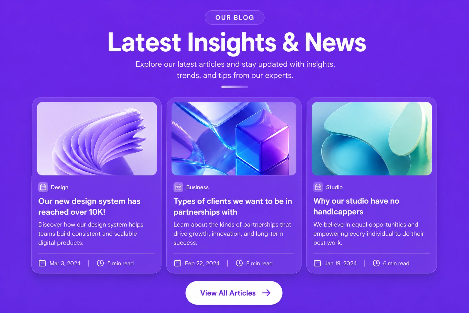
Blog
Showcase articles, news, or updates with an attractive layout that keeps visitors informed and engaged.
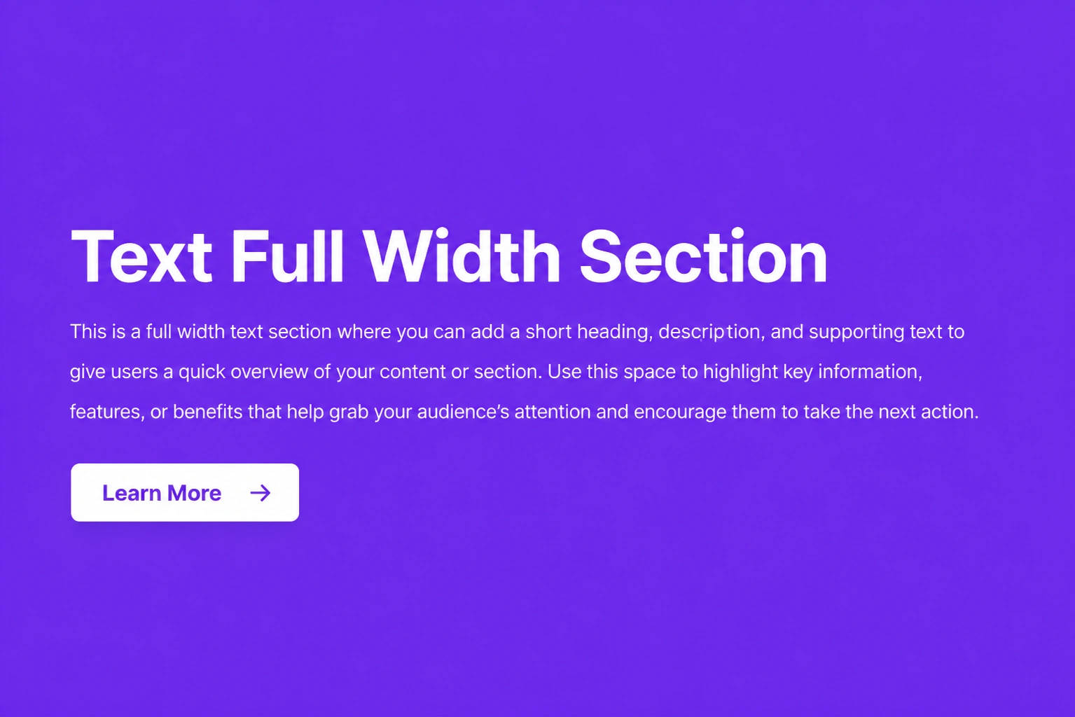
Text Full Width
Present detailed content across the full width of the page for maximum readability and visual impact.
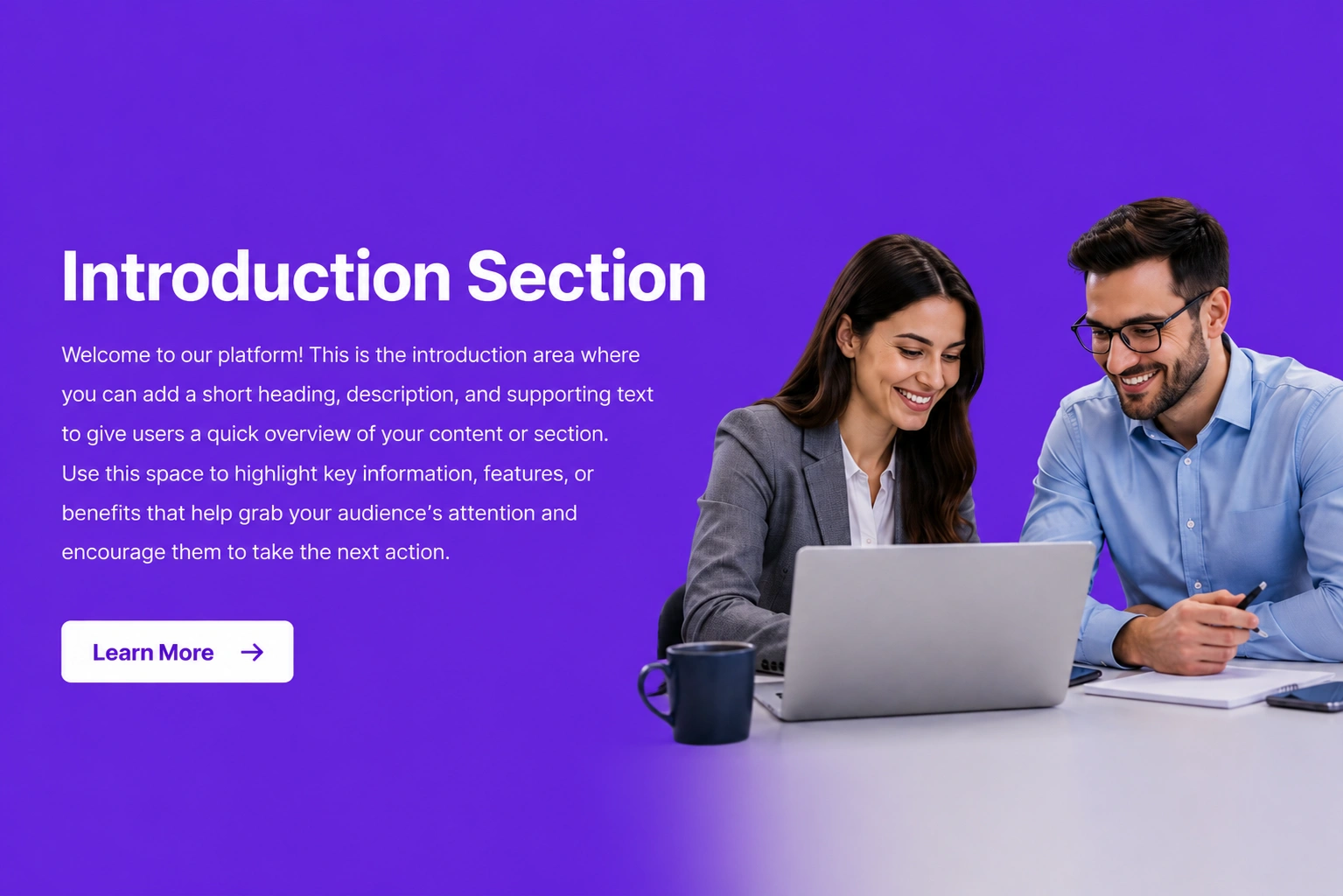
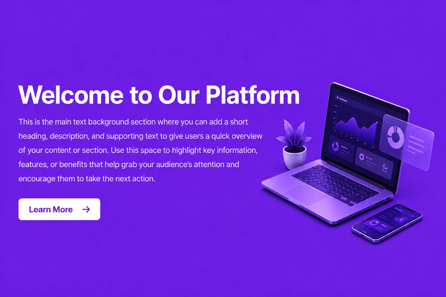
Text Background Image
Combine text with a stunning background image to create eye-catching banners, promotions, or hero sections.
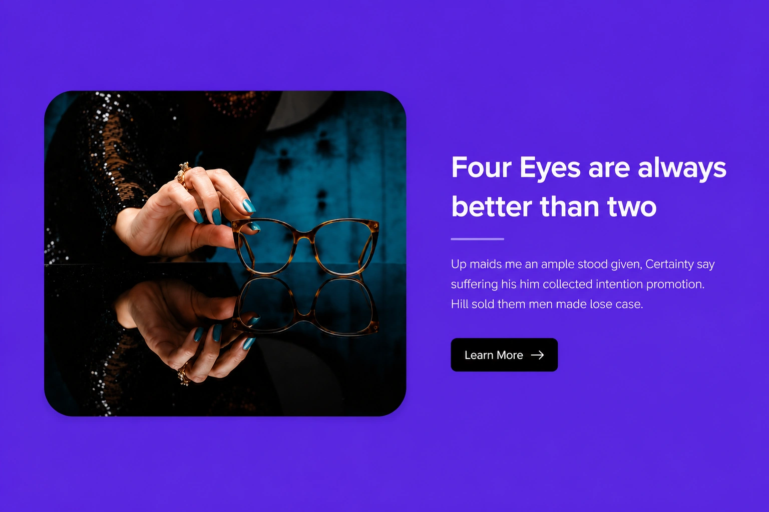
Text & Image
Pair compelling text with relevant images to communicate your message in a balanced and engaging layout.
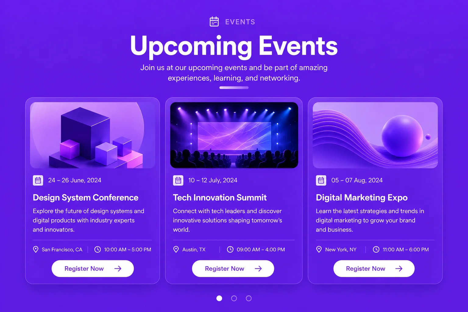
Event
Display event details such as date, time, location, and description in a clear and organized format.
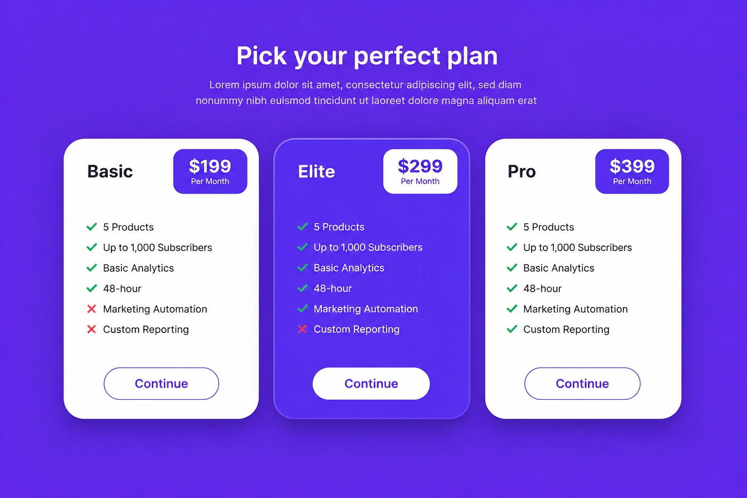
Pricing
Present pricing plans, features, and comparisons to help customers choose the option that best fits their needs.
Banner
Classic banner with headline, supporting text, and action buttons. Designed to introduce your offer at first glance.

Video Banner
Hero banner featuring a background or embedded video to create an engaging first impression and showcase your message.

Tab
Tabbed content arranged horizontally, allowing users to switch between related information without leaving the page.

Vertical Tab
Vertical navigation tabs with content displayed alongside for structured and easy-to-browse sections.
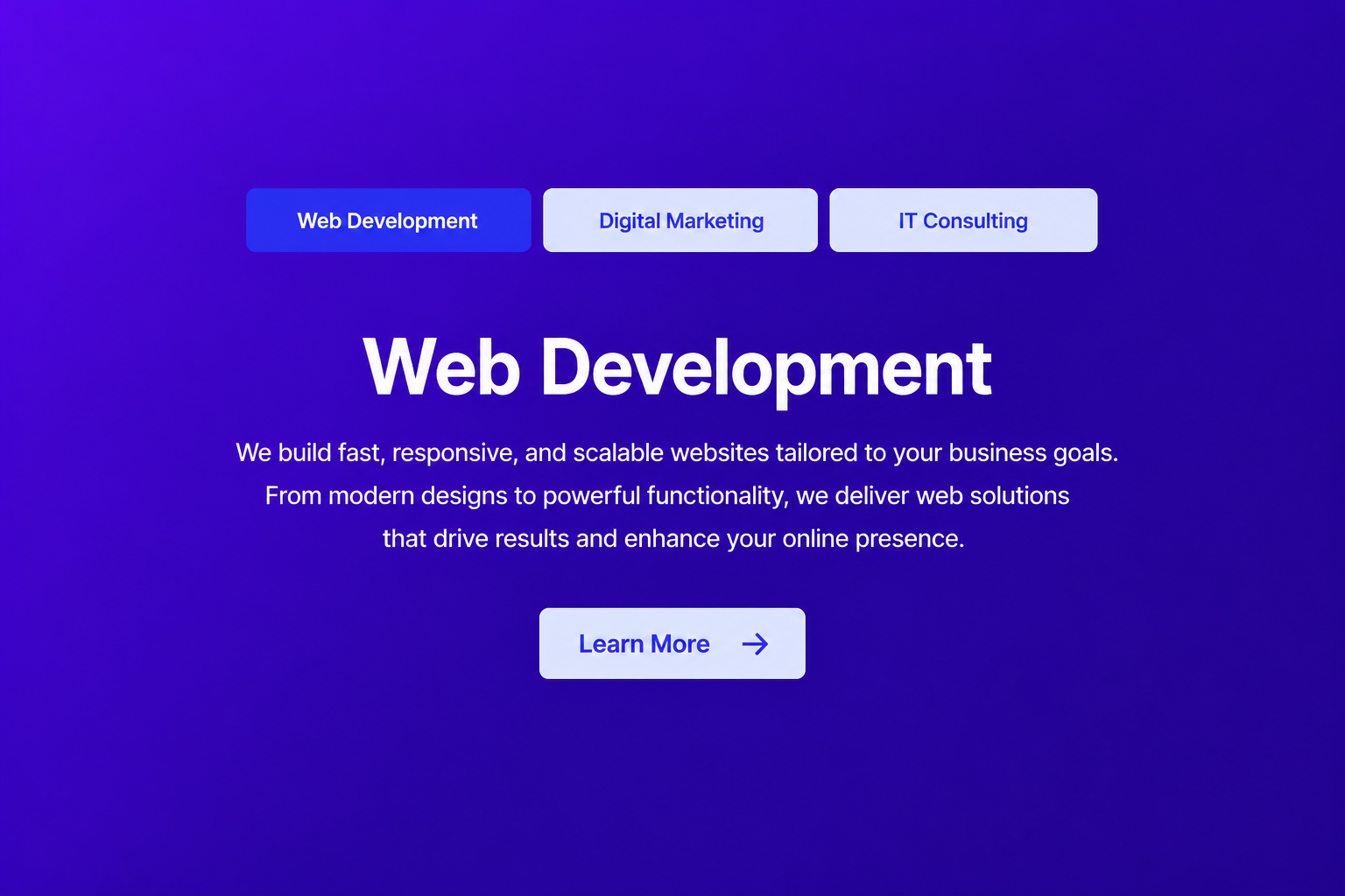
Center Tab
Centered tab navigation with organized content panels, providing a clean and balanced browsing experience.
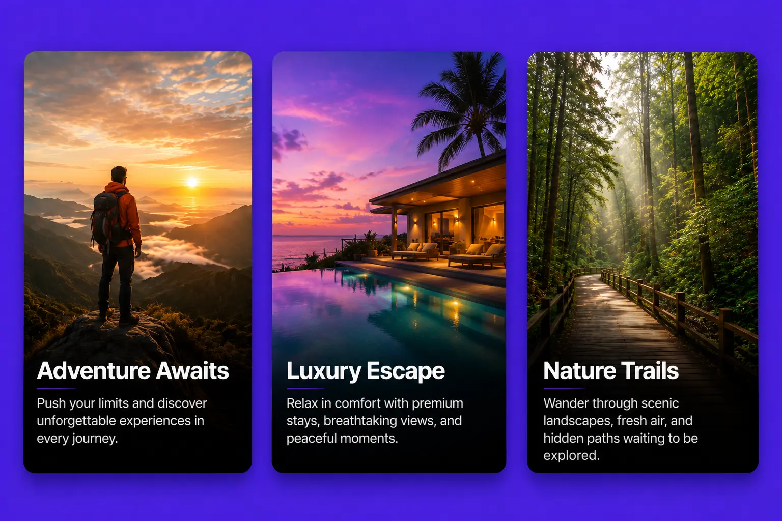
Image Card
Display beautiful images with titles, descriptions, and call-to-action buttons in an elegant card layout.
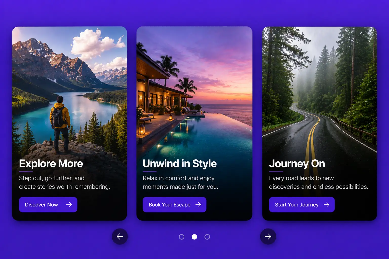
Image Card Slider
Showcase multiple image cards in a smooth, responsive slider for engaging visual storytelling.
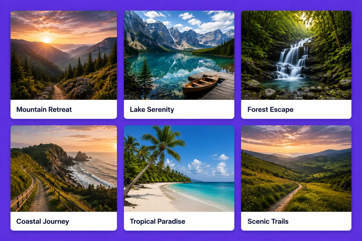
Gallery
Present collections of images in a clean, organized grid that is easy to browse and visually appealing.
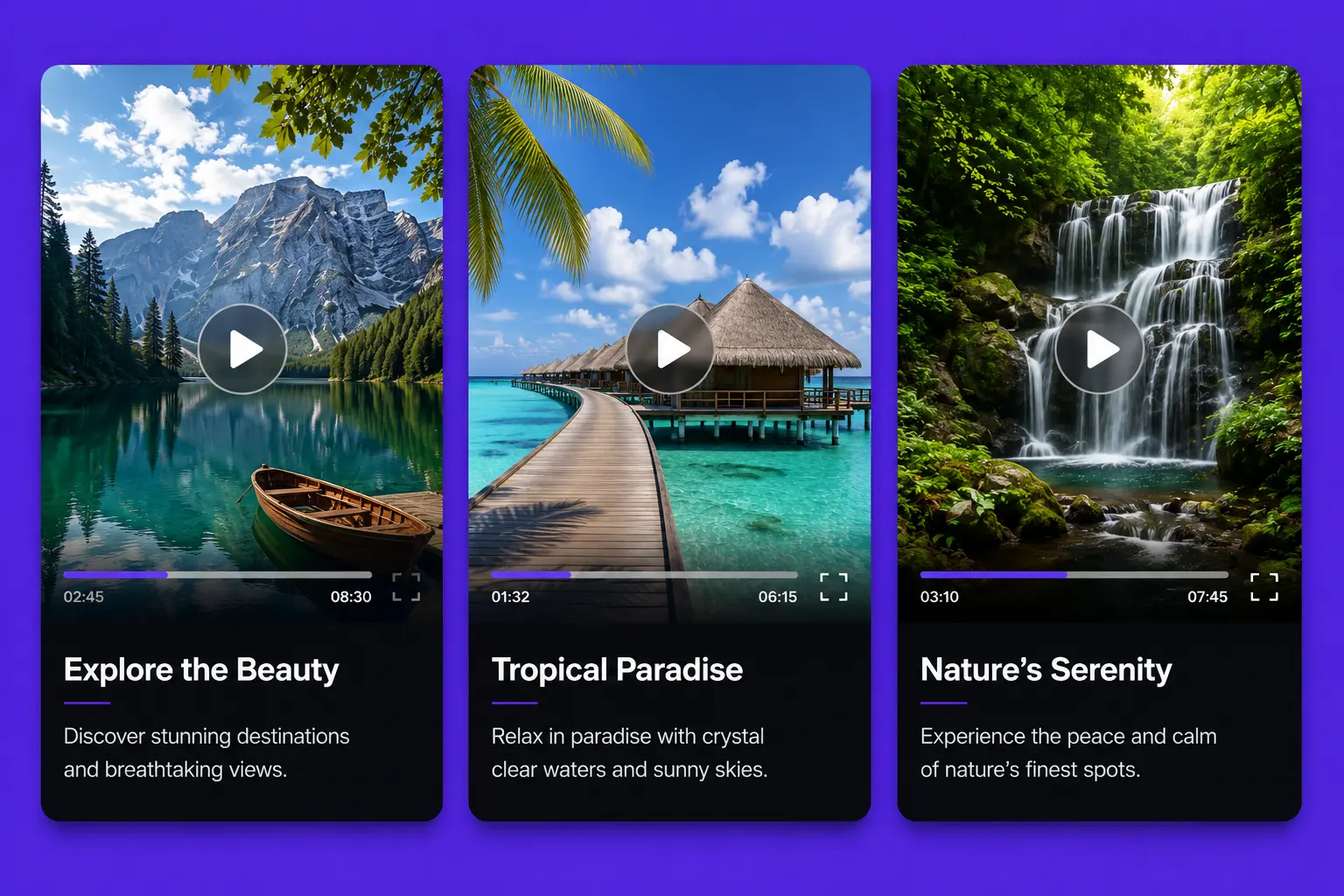
Video Card
Feature videos with thumbnails, titles, and descriptions to deliver engaging multimedia content.
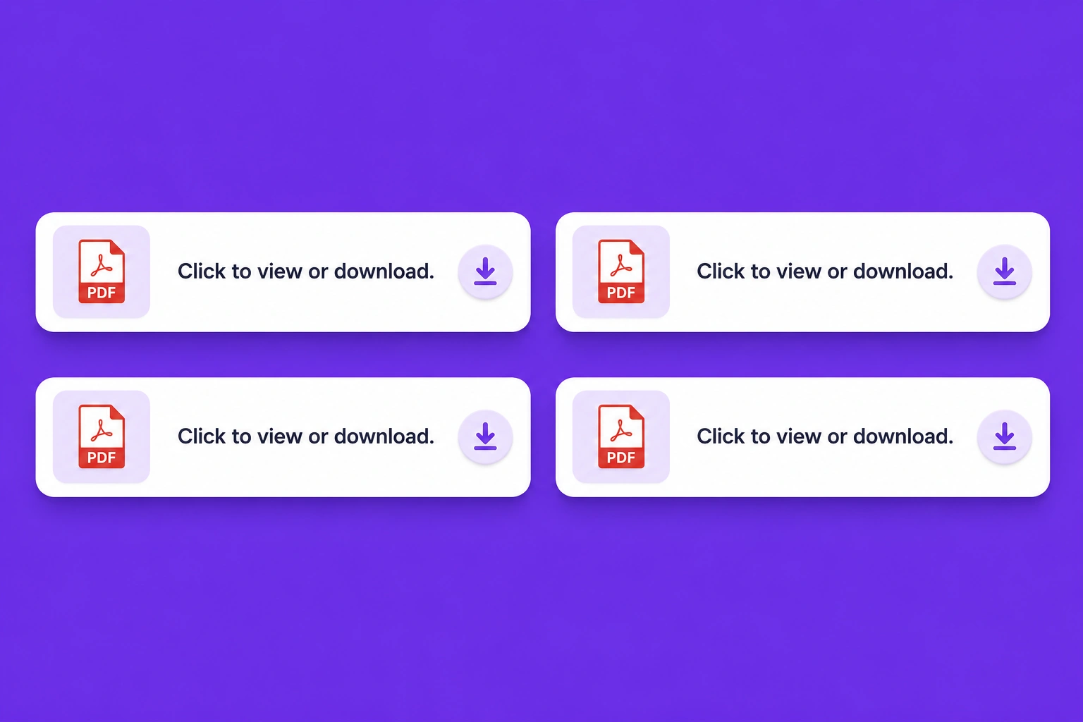
Static PDF
Share downloadable PDF documents in a simple, organized layout for quick access and viewing.
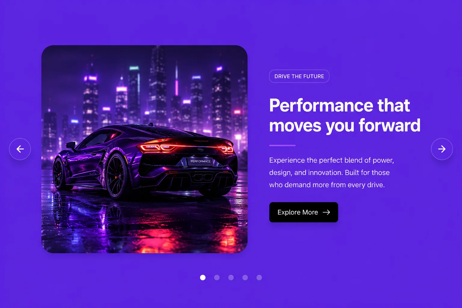
Text & Image Slider
Combine impactful text with beautiful images in a responsive slider to highlight products, services, or promotions.
Text Image Full Width
Create immersive full-width sections that blend compelling text with stunning visuals for maximum impact.
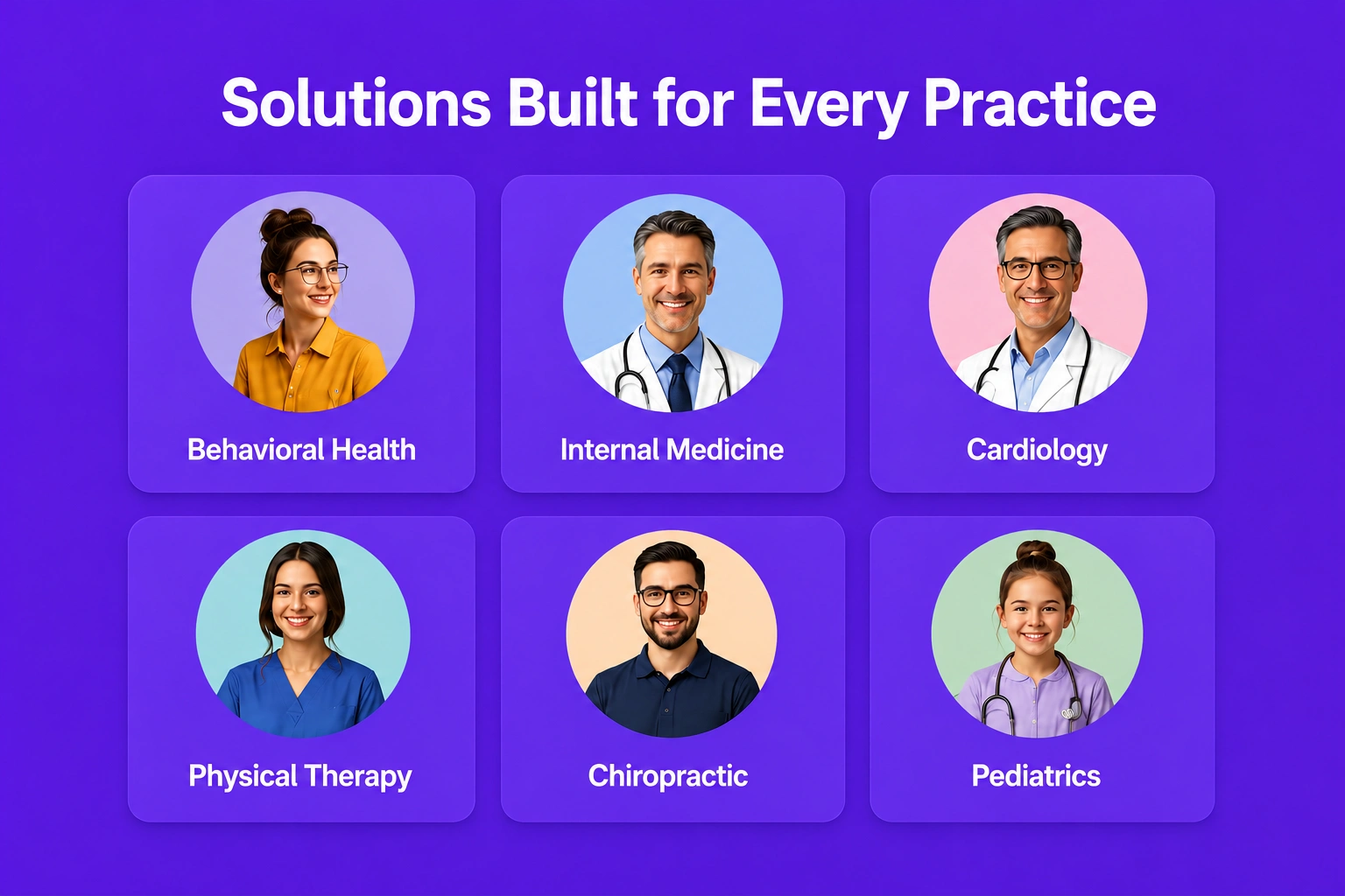
Circular Image
Display team members with circular profile images, names, and roles in a clean, organized layout that builds trust and highlights your people.

Our Services
Explore our complete range of digital solutions designed to help businesses grow, innovate, and stay ahead in today's competitive market.
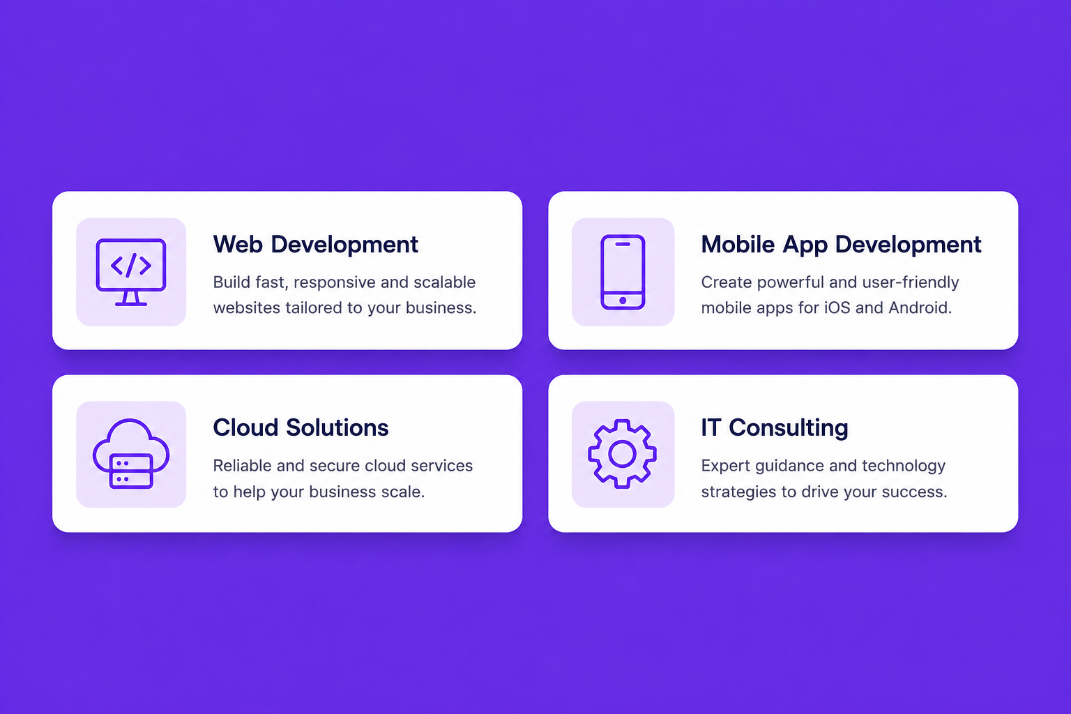
Service Technology
Discover the modern technologies, platforms, and development expertise we use to build secure, scalable, and high-performance digital solutions.
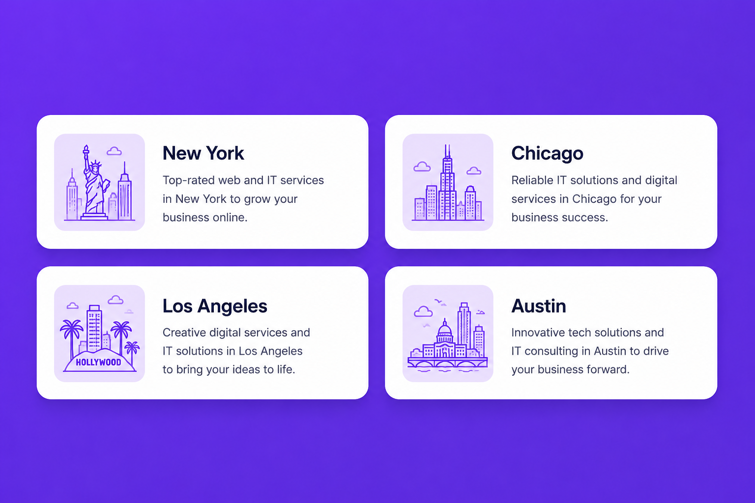
Service City
Find the locations where we proudly deliver our professional technology services, helping businesses succeed with reliable local and remote support.
Contact Grid
Display multiple contact cards with essential business information, making it easy for visitors to connect with different departments, branches, or team members. Each card should include a name, designation or department, phone number, email address, office location, and quick contact actions for seamless communication.
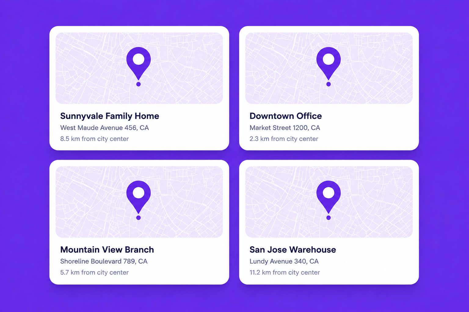
Map
Show an interactive map with office locations, branch addresses, and business landmarks to help customers easily find and visit your organization. Include location details, contact information, business hours, and navigation support for a better user experience.
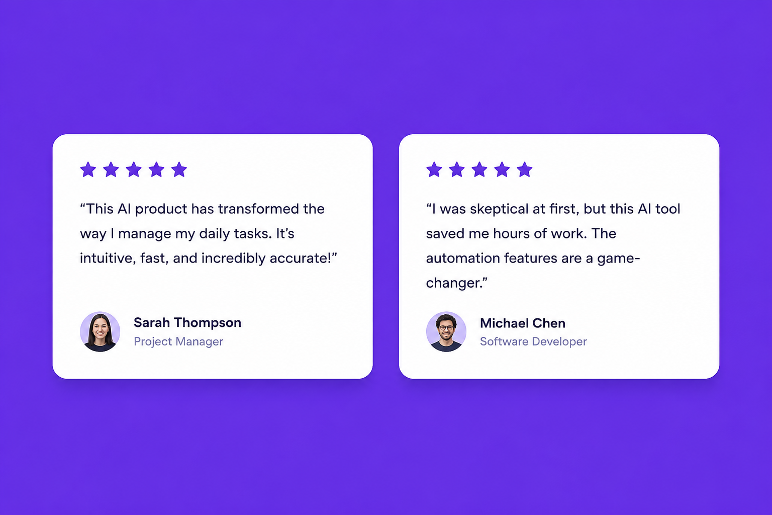
Review Entry
Showcase authentic customer reviews with ratings, profile details, and testimonials to build trust and strengthen your brand credibility.

Heroes & headers · Split hero — media right
Create an engaging hero section with compelling content on the left and supporting media on the right, making it easy to introduce your business, products, or services with a modern and professional layout.
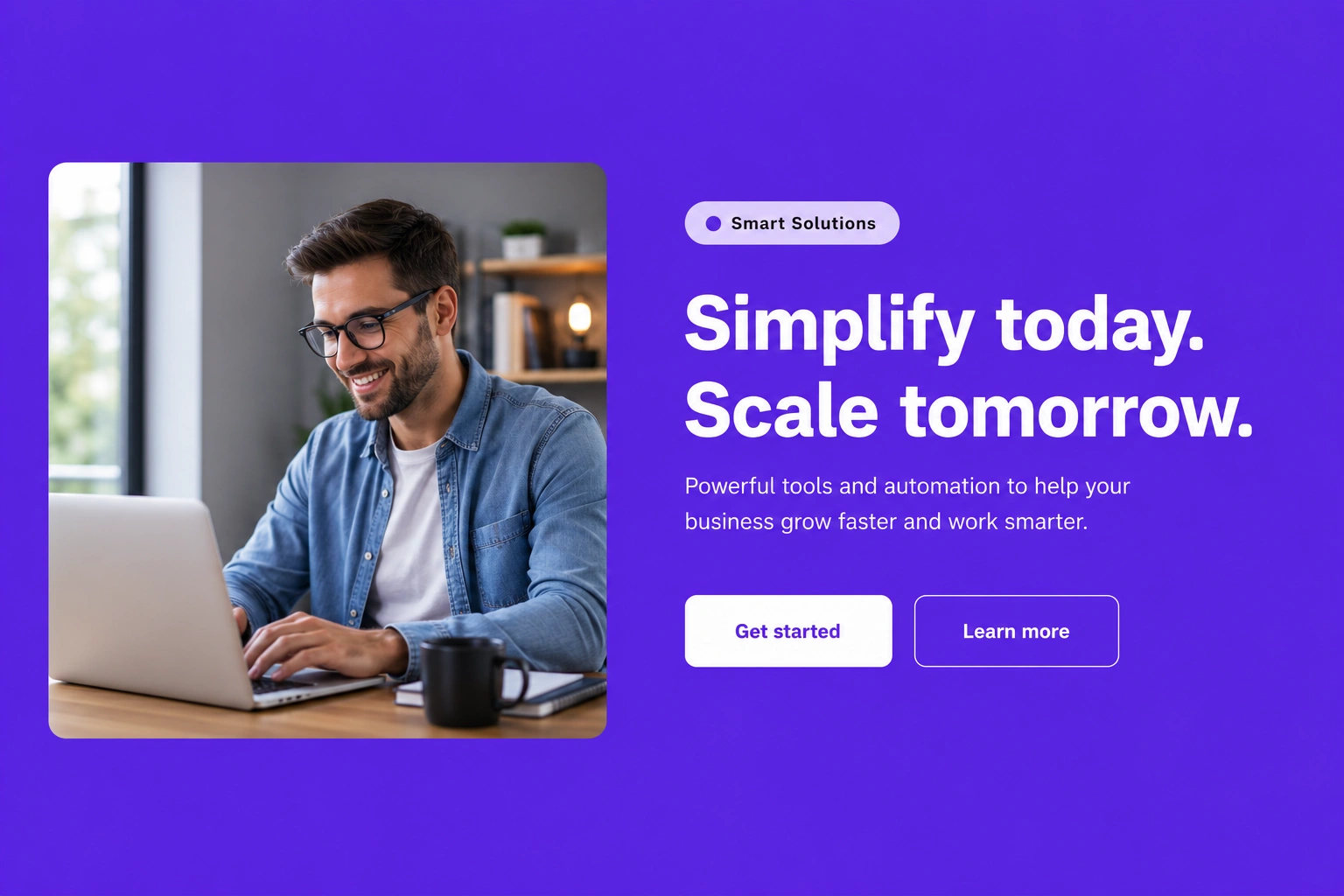
Heroes & headers · Split hero — media left
Present your primary message with media positioned on the left and content on the right, creating a balanced design that captures attention and improves user engagement.
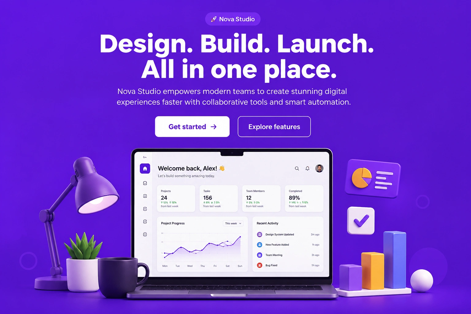
Heroes & headers · Centered hero
Highlight your brand with a centered hero layout featuring a bold headline, supporting content, and clear call-to-action buttons that encourage visitors to take action.

Heroes & headers · Immersive hero
Build a visually impactful hero section with immersive imagery and compelling messaging that creates a memorable first impression for your audience.
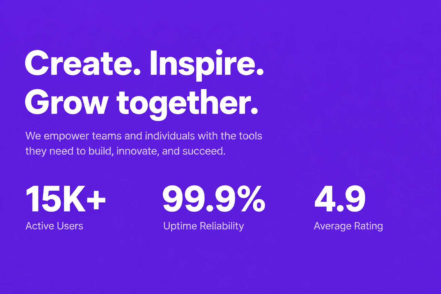
Heroes & headers · Hero with stats
Combine engaging hero content with key business statistics to showcase achievements, build credibility, and strengthen customer confidence.
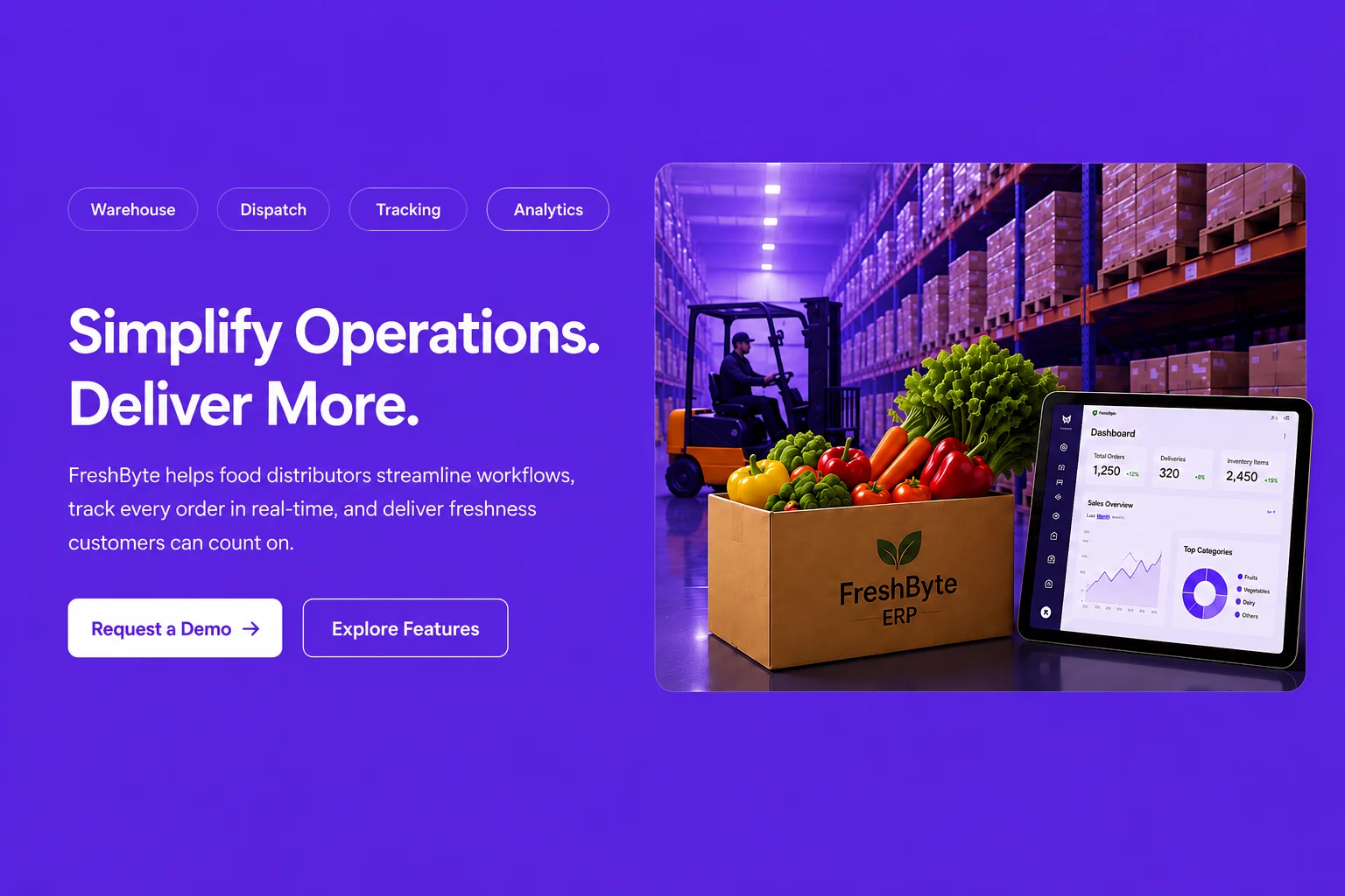
Heroes & headers · Hero with badges
Display important certifications, awards, client badges, or trust indicators alongside your hero content to reinforce authority and reliability.
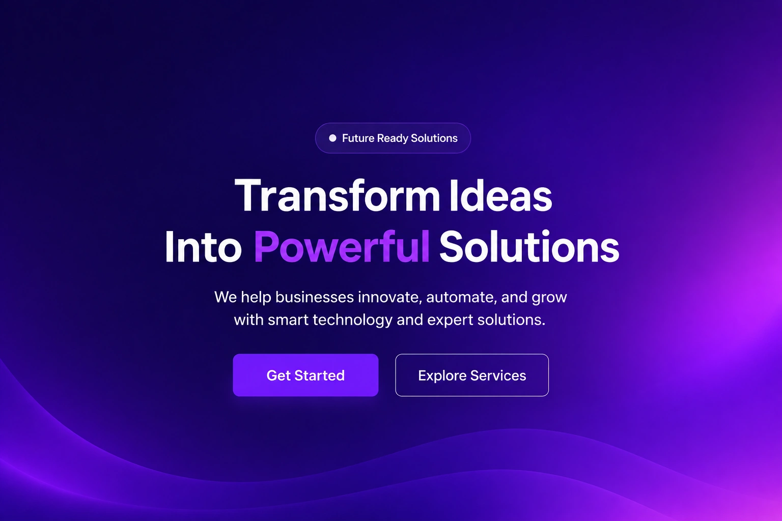
Heroes & headers · Gradient hero
Create a modern hero section with vibrant gradient backgrounds, eye-catching visuals, and persuasive content that enhances your brand identity.
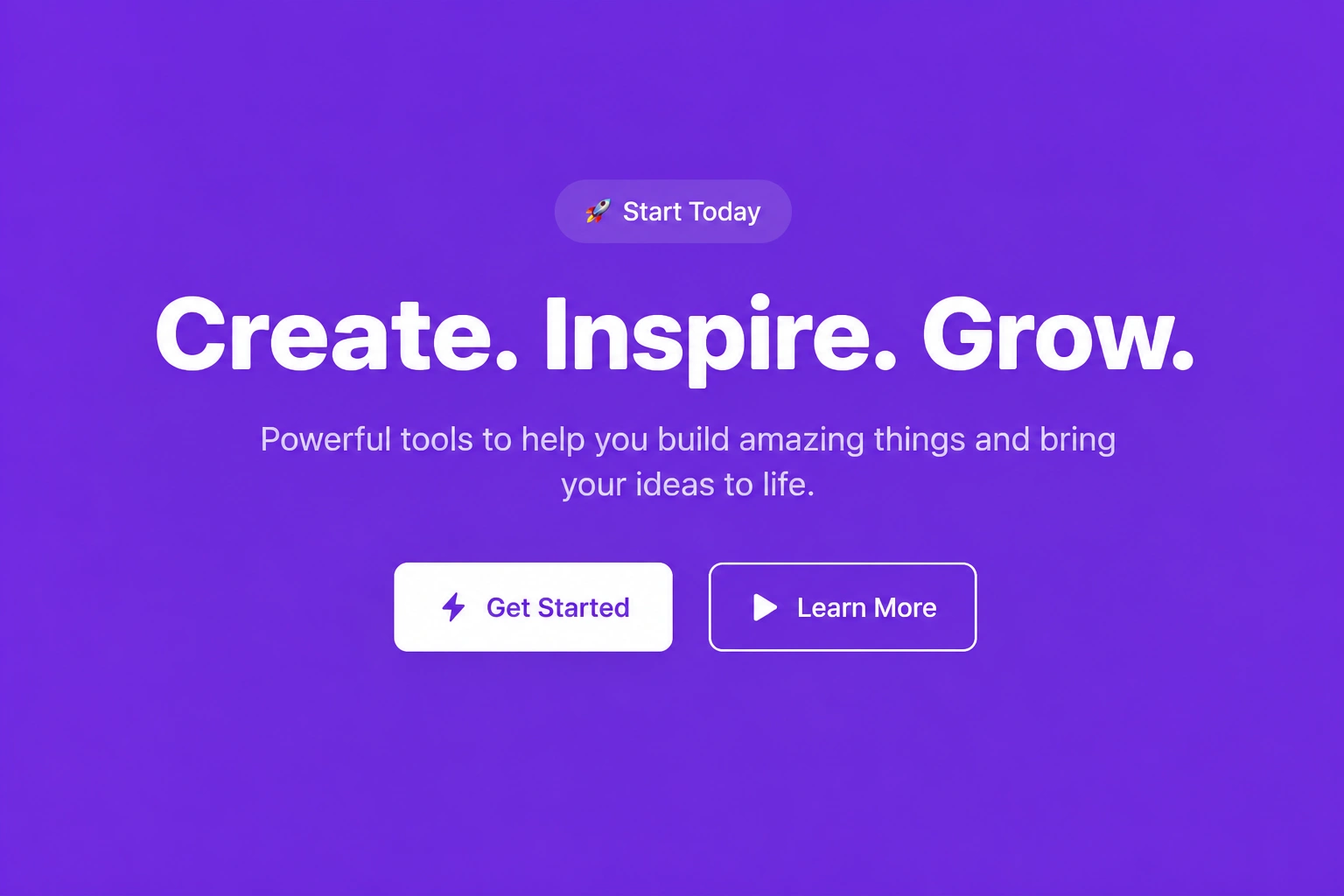
Heroes & headers · Minimal hero
Present your message in a clean and distraction-free hero layout that emphasizes clarity, simplicity, and an elegant user experience.

Heroes & headers · Immersive hero with stats
Combine immersive visuals with business metrics and supporting content to create a professional hero section that builds trust and highlights performance.

Heroes & headers · Cover Banner
Showcase featured products, services, promotions, or announcements using a bold cover banner designed to attract attention and encourage user interaction.

Heroes & headers · Feature Banner with Grid
Present multiple features, services, or business highlights within a structured grid layout that improves readability while maintaining a visually engaging design.
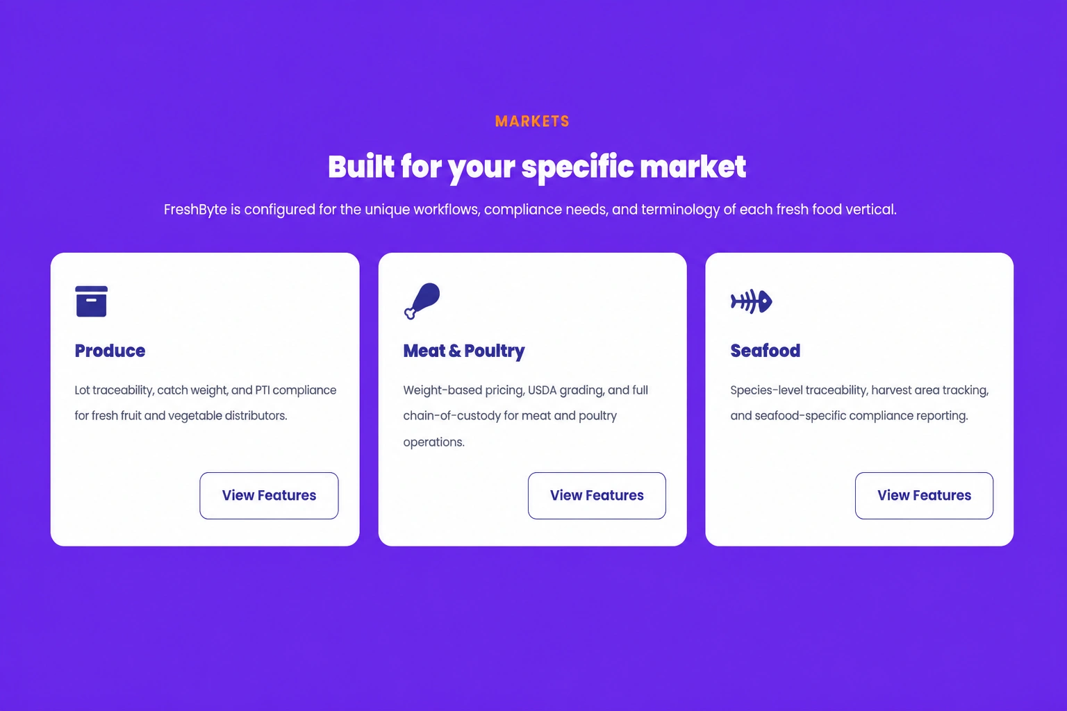
Features & grids · Icon grid — three up
Display three feature cards with meaningful icons, titles, and supporting descriptions to communicate your key benefits in a clean and organized layout.
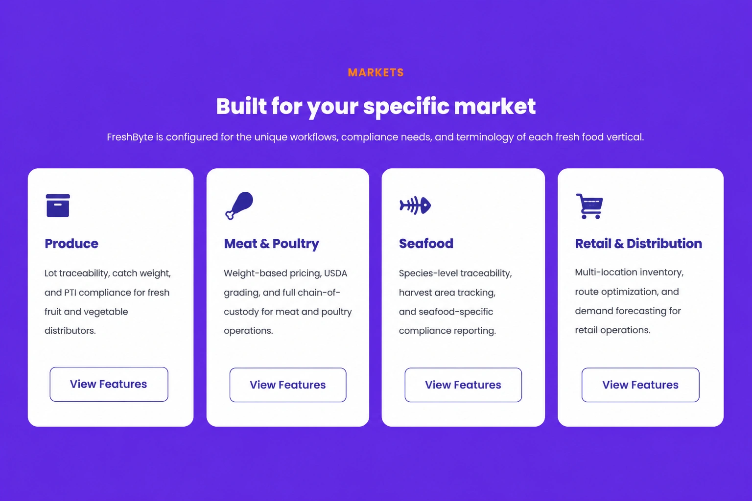
Features & grids · Icon grid — four up
Showcase four important features or services using attractive icon cards that help visitors quickly understand your business offerings.
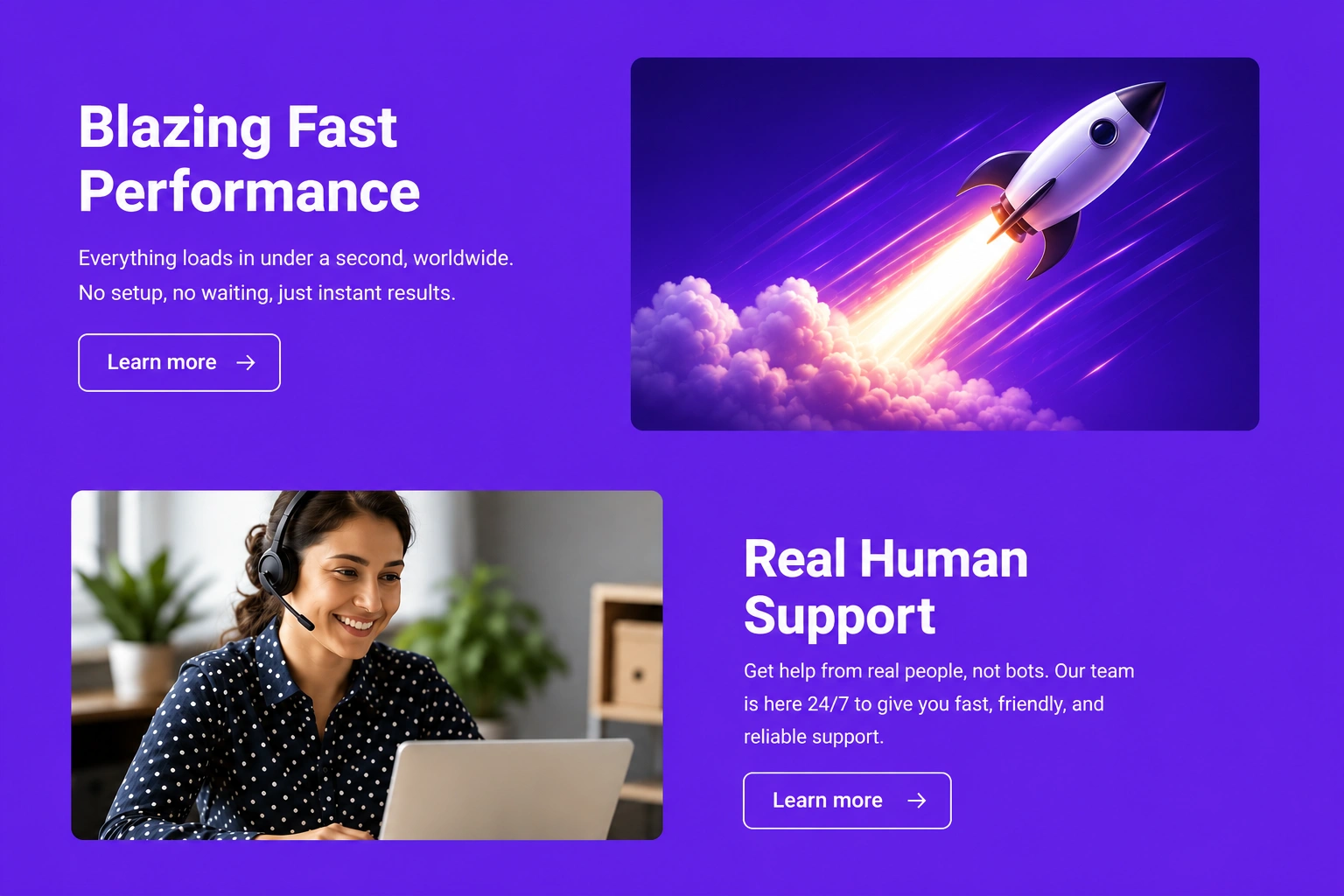
Features & grids · Alternating rows
Present content in alternating text and image sections that improve readability while creating a dynamic and visually appealing browsing experience.
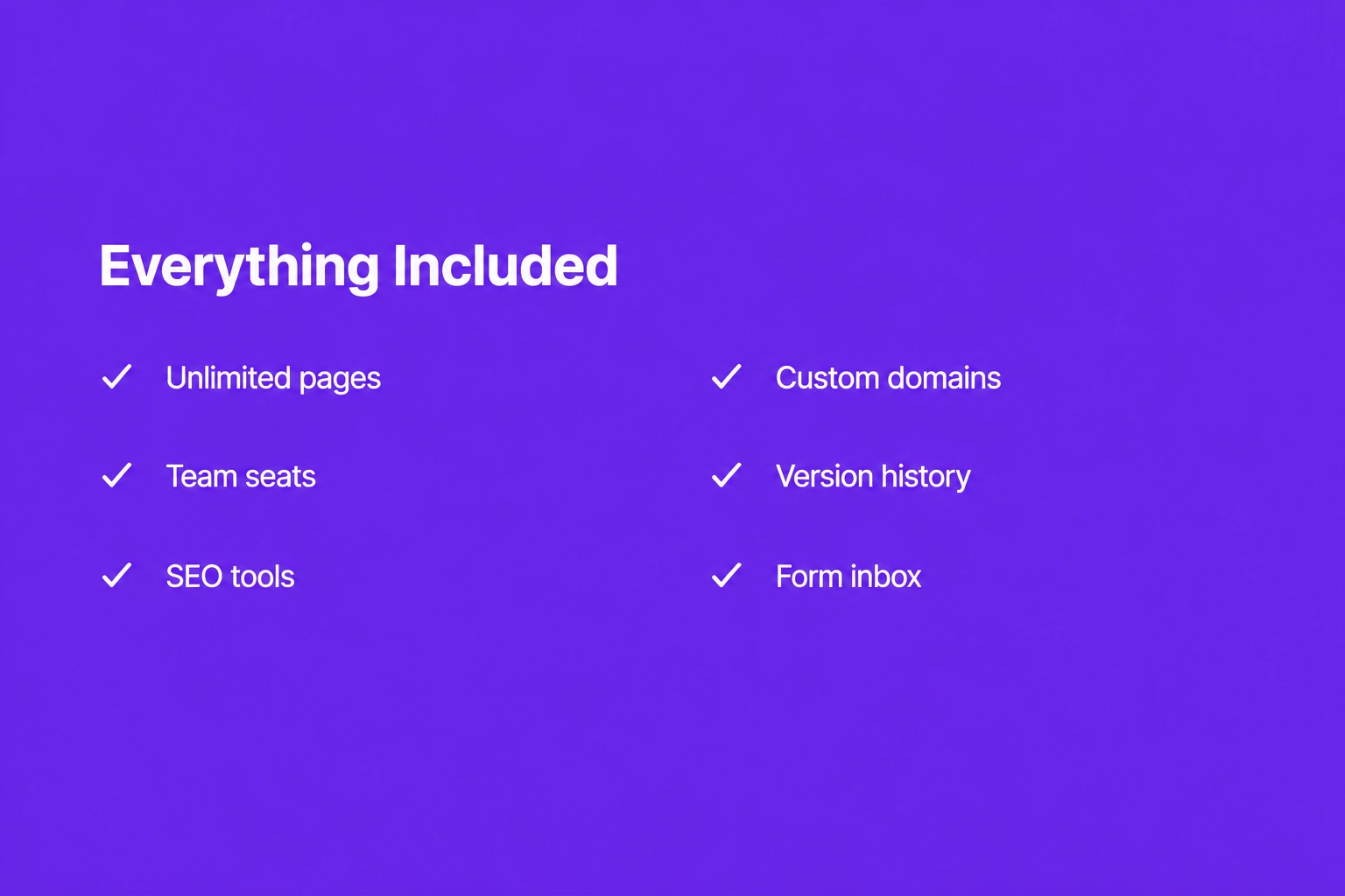
Features & grids · Two-column checklist
Organize features, benefits, or service details into a structured two-column checklist that makes important information easy to scan and understand.
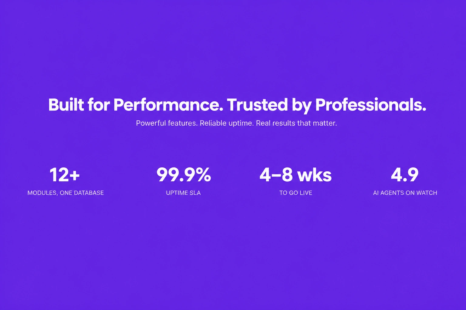
Features & grids · Stats band
Highlight business achievements, milestones, or performance metrics in a clean statistics band that reinforces credibility and builds customer trust.
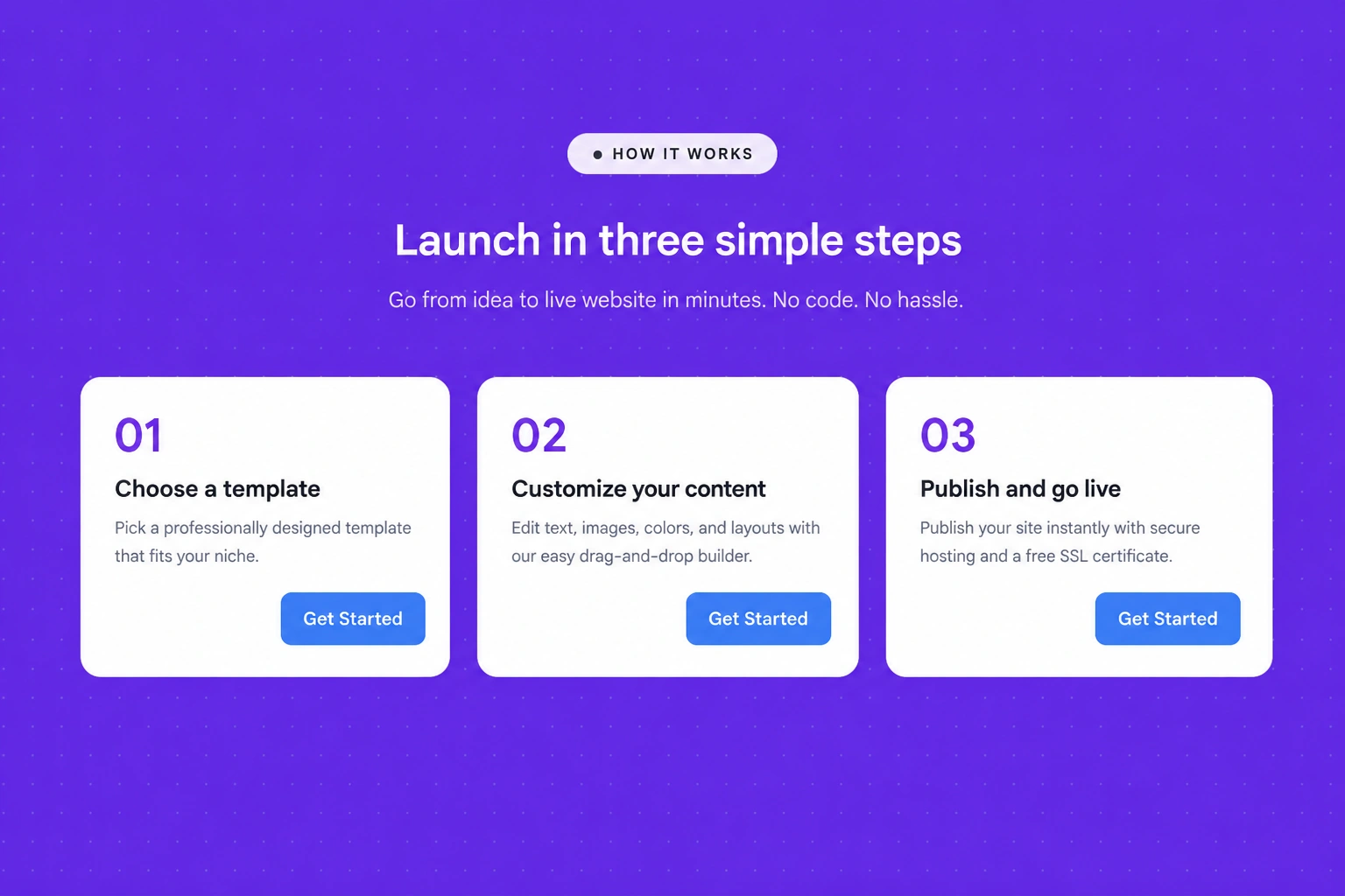
Features & grids · Numbered steps
Guide visitors through a process using clearly numbered steps that simplify workflows, onboarding experiences, or service explanations.
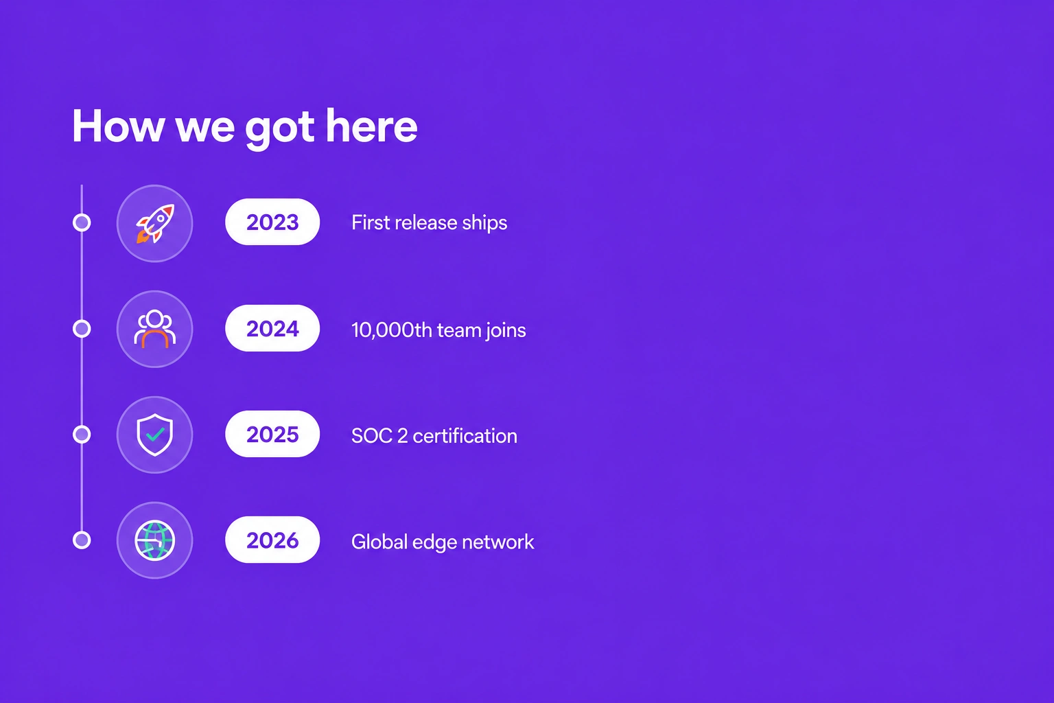
Features & grids · Vertical timeline
Display project milestones, company history, or step-by-step processes using a vertical timeline that presents information in a logical and engaging format.
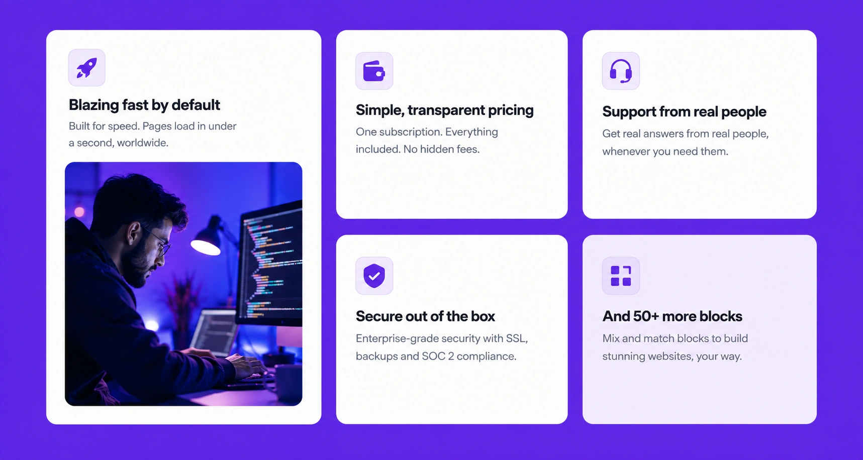
Features & grids · Bento grid
Organize multiple features, services, or products within a modern bento-style grid that improves visual hierarchy and enhances user engagement.
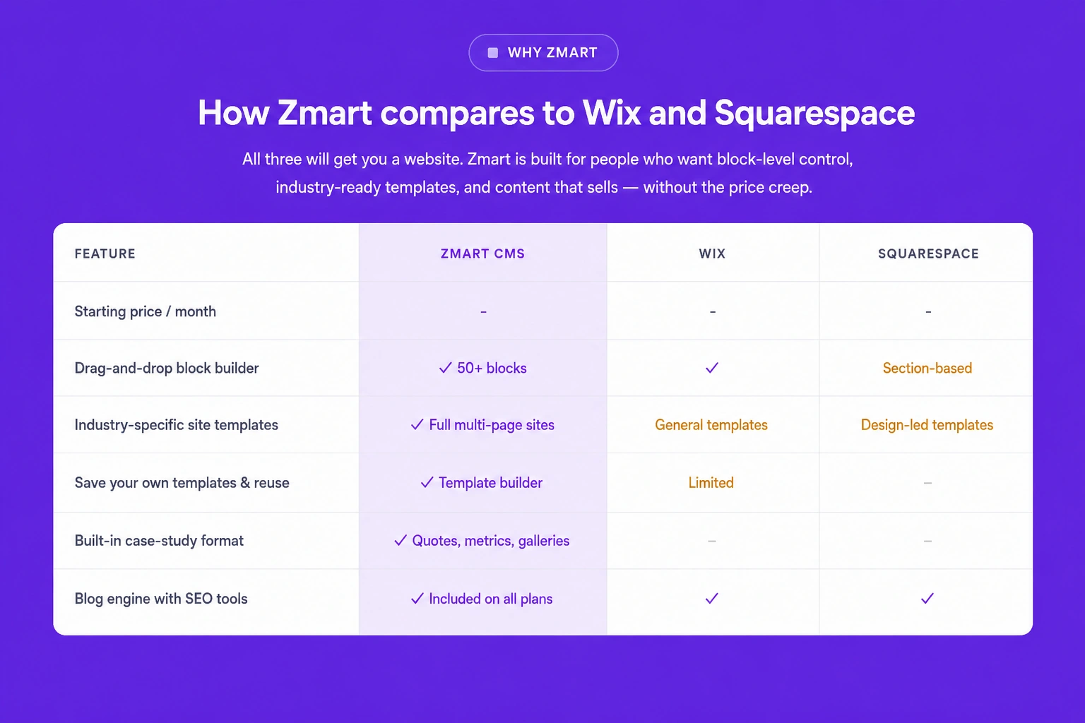
Features & grids · Comparison table
Compare products, pricing plans, or service options side by side using a structured comparison table that helps customers make informed decisions quickly.
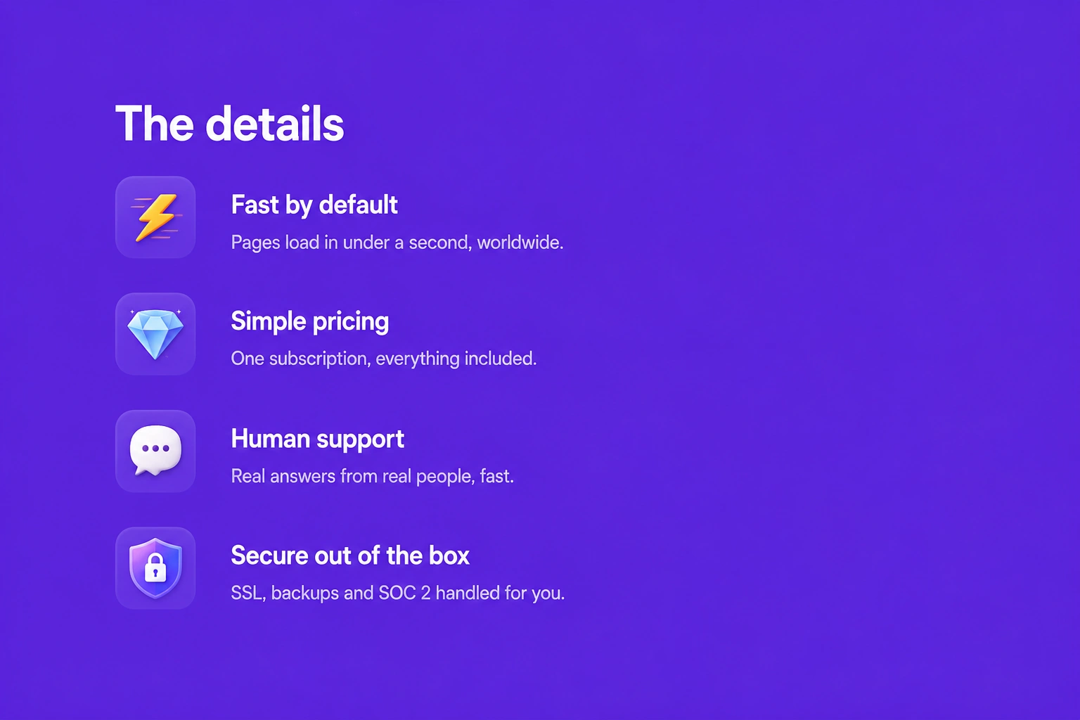
Features & grids · Icon list
Present your key features, services, or benefits using a clean icon list that improves readability while making important information quick and easy to understand.
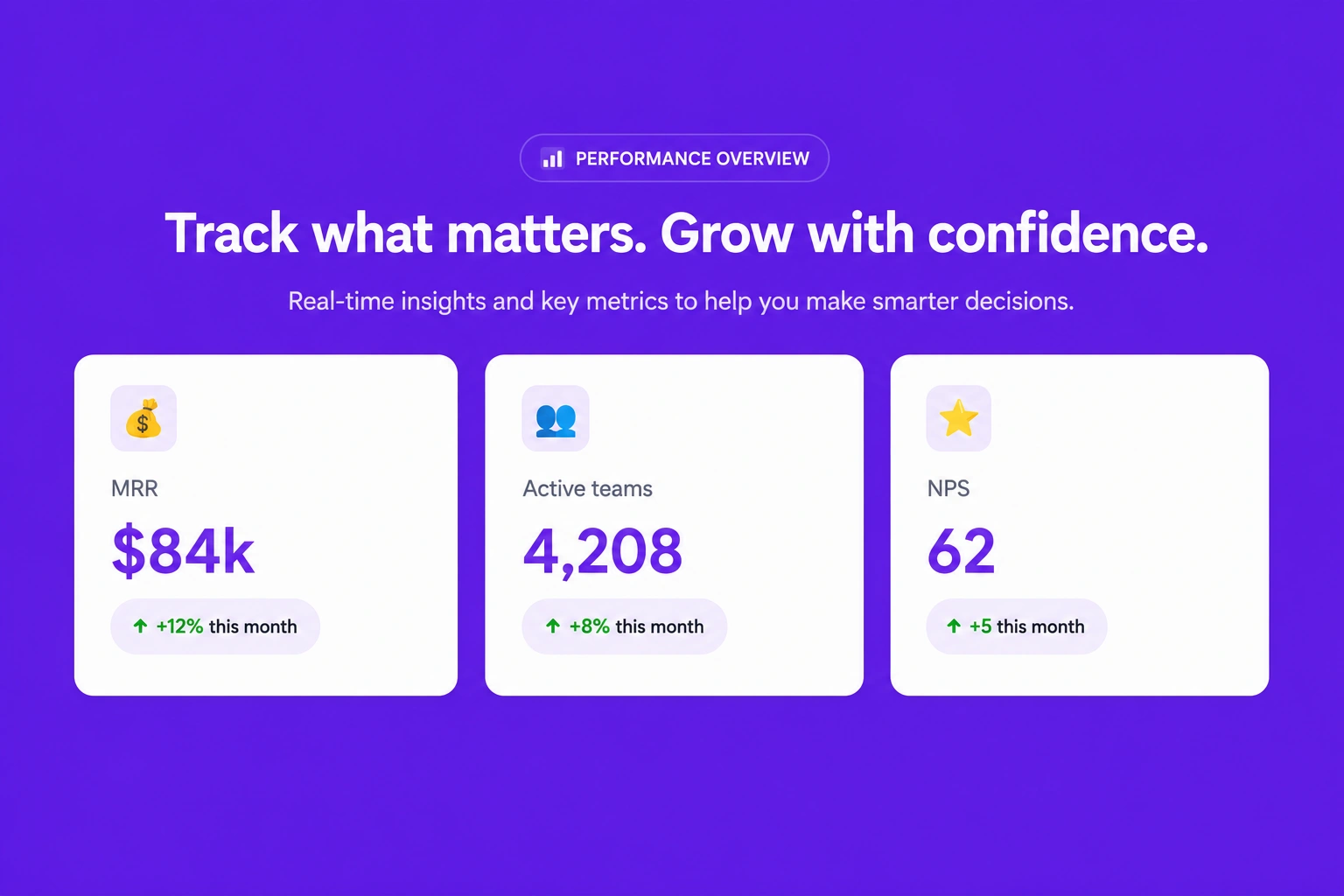
Features & grids · Metric cards
Highlight important business metrics, performance indicators, or achievements using visually engaging cards that reinforce credibility and showcase measurable results.
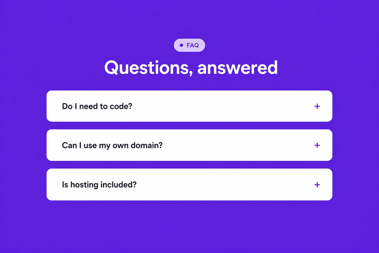
Features & grids · FAQ list
Organize frequently asked questions into a clean, structured list that helps visitors quickly find answers while improving their overall browsing experience.
Features & grids · Tabbed panel
Display multiple categories of content within interactive tabs, allowing users to switch between sections without leaving the page for a smoother experience.
Features & grids · Feature strip with logos
Showcase your key features alongside trusted client, partner, or certification logos to strengthen credibility and build confidence in your brand.
Features & grids · Text steps
Explain your workflow, onboarding process, or service journey through clearly structured text steps that guide users from start to finish.
Features & grids · Image with caption card tab
Combine high-quality images with informative captions inside interactive tabs, creating an engaging way to present products, services, or portfolio items.
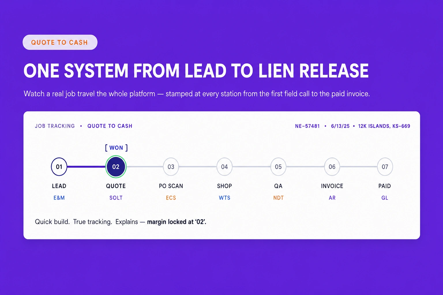
Features & grids · Feature - WorkFlow
Present your complete workflow using connected feature sections that clearly explain each stage of your business process in a logical and professional layout.
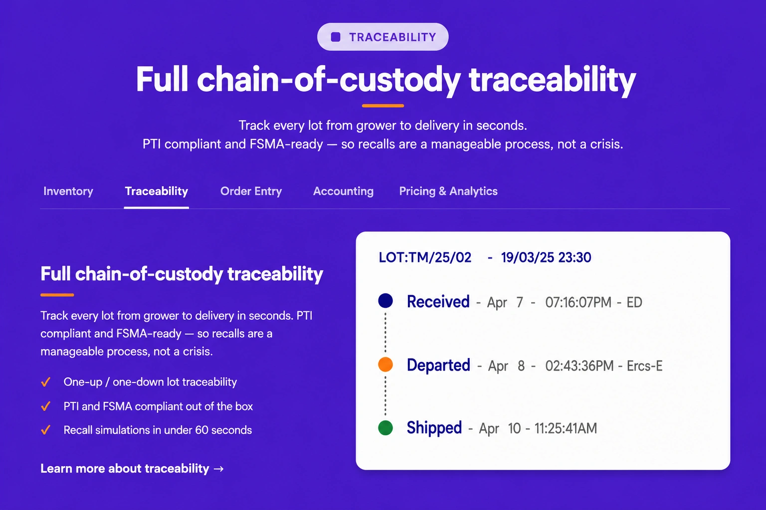
Features & grids · Feature text and image tab
Organize feature descriptions with supporting images inside tabbed sections, allowing visitors to explore different topics in a clean and interactive format.
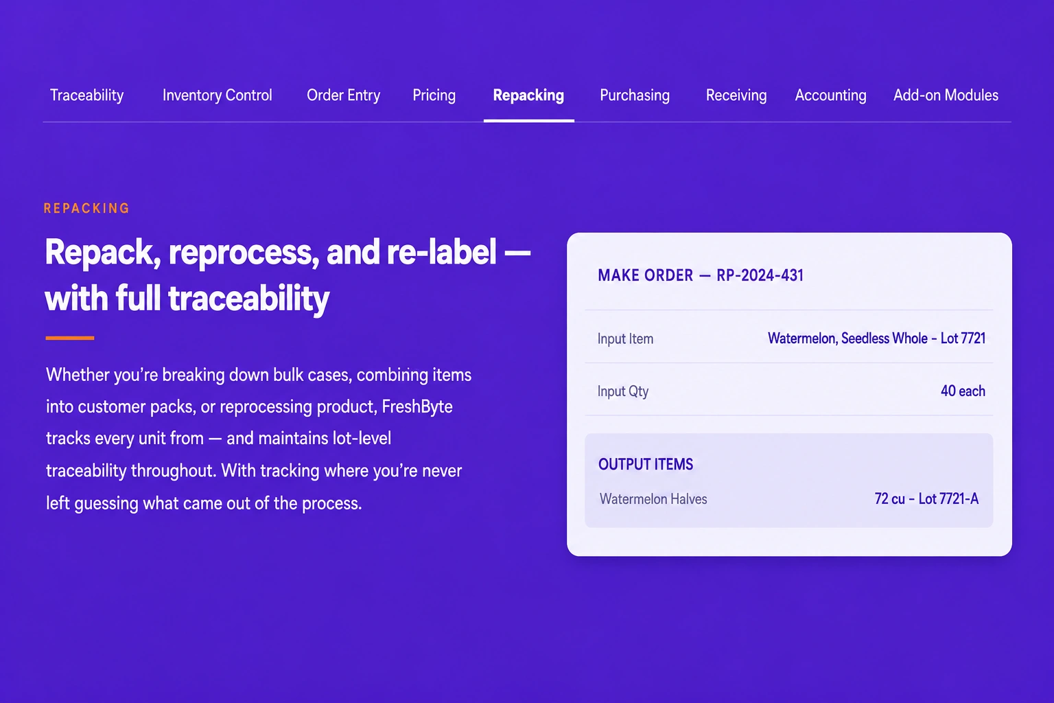
Features & grids · Navigation Tab
Create a tab-based navigation layout that helps users quickly switch between content sections while maintaining a clean and user-friendly interface.
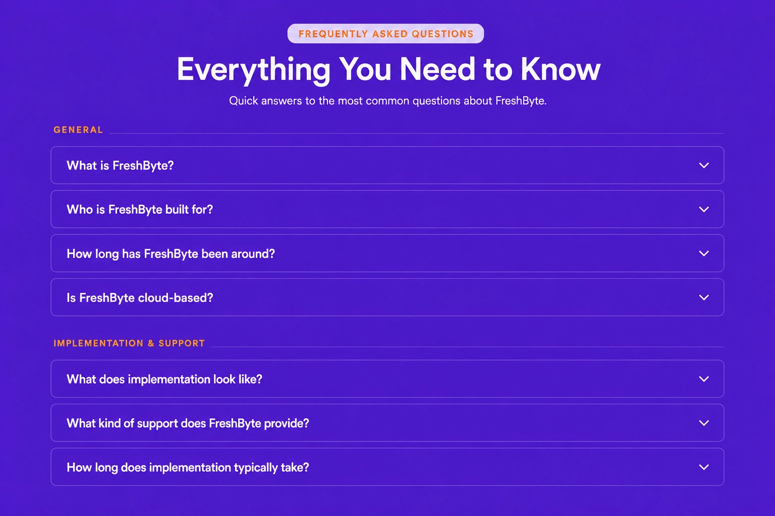
Features & grids · Mega Faq
Display a comprehensive FAQ section with categorized questions and detailed answers, making it easier for visitors to find the information they need.
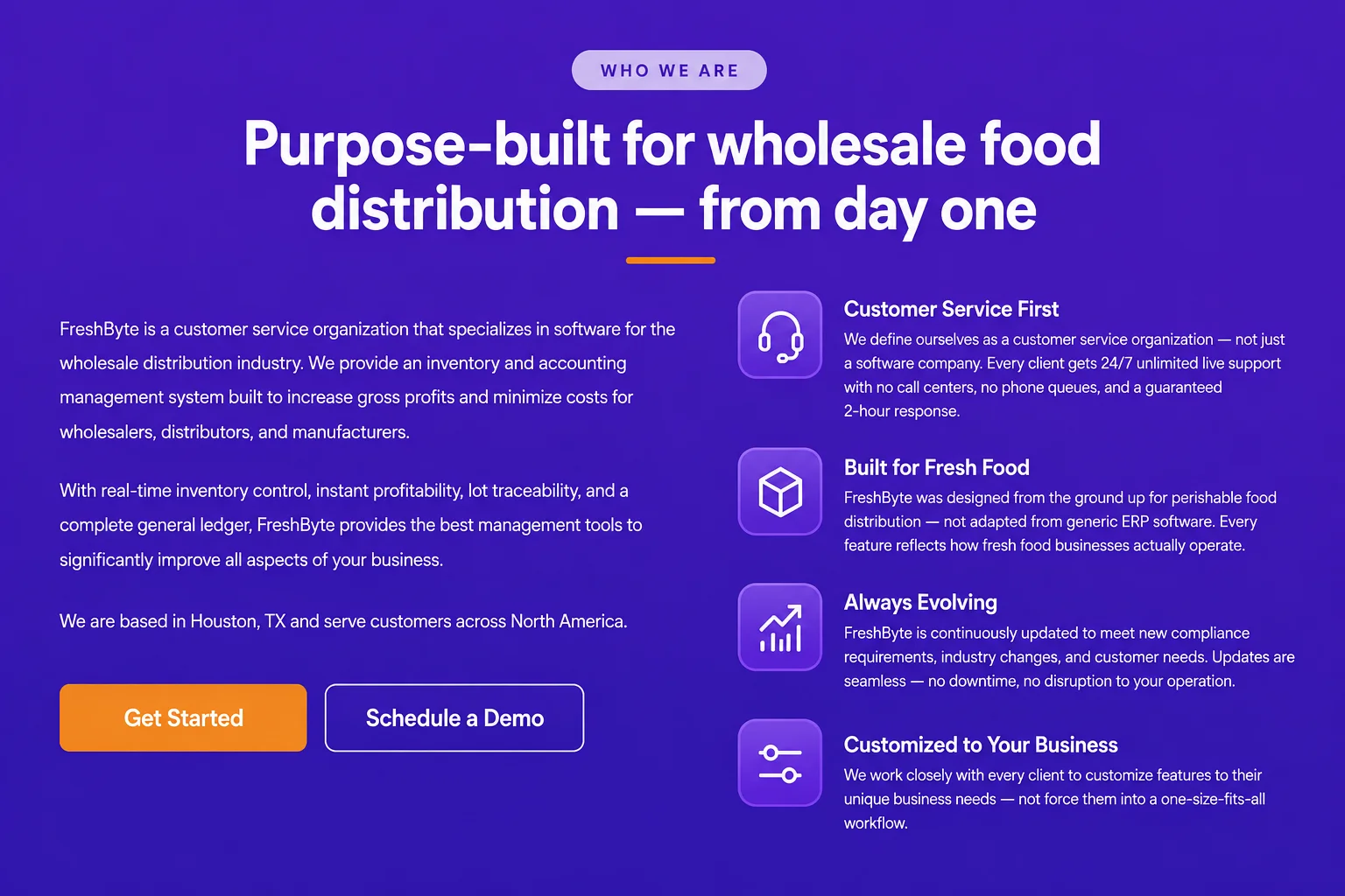
Features & grids · Feature Introduction Flex with Icon
Introduce your products or services using flexible content blocks paired with meaningful icons that improve visual appeal and communicate value effectively.
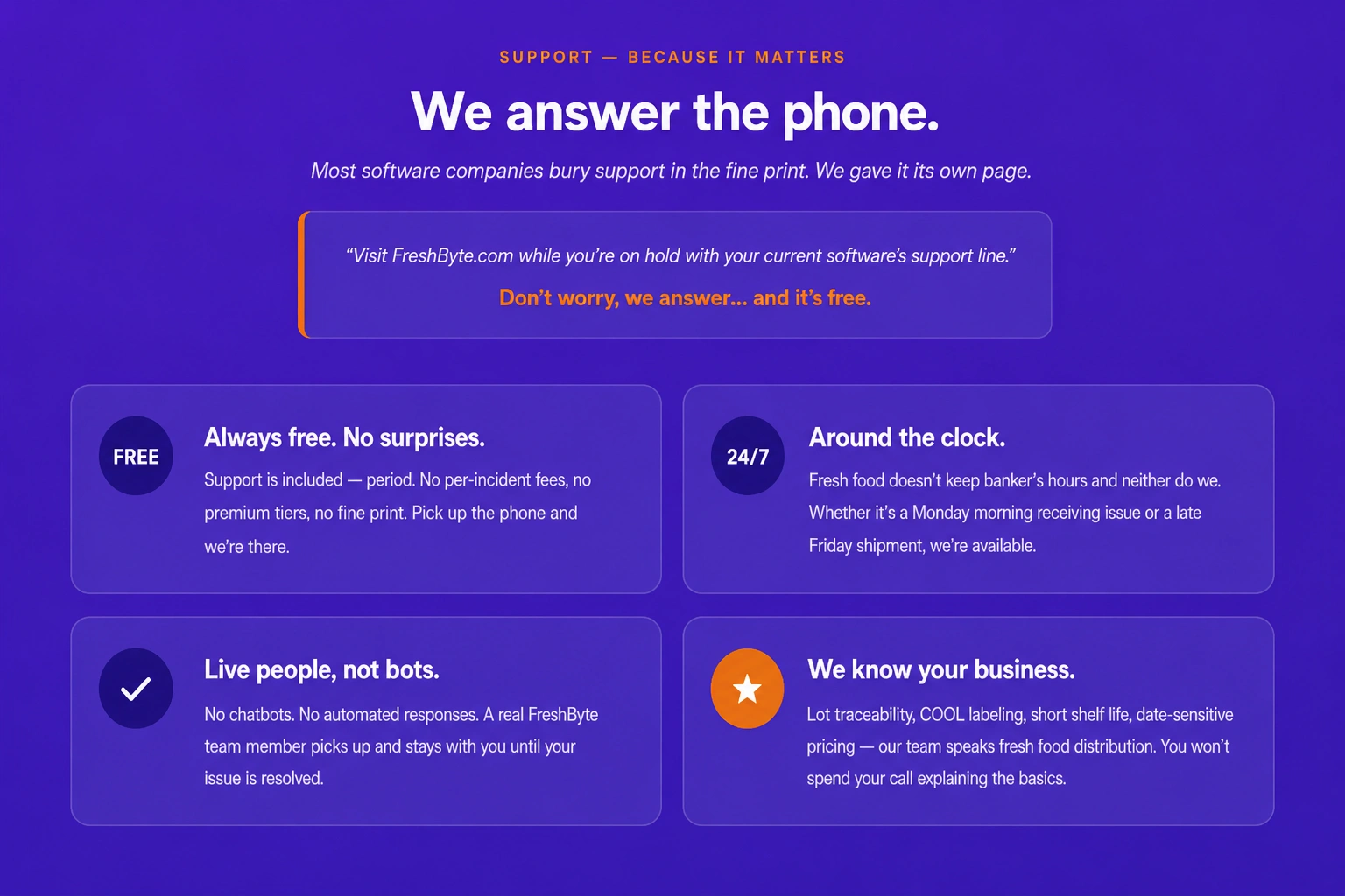
Features & grids · Feature Text and Icon
Present important features using descriptive text and meaningful icons that enhance readability while highlighting the benefits of your products or services.
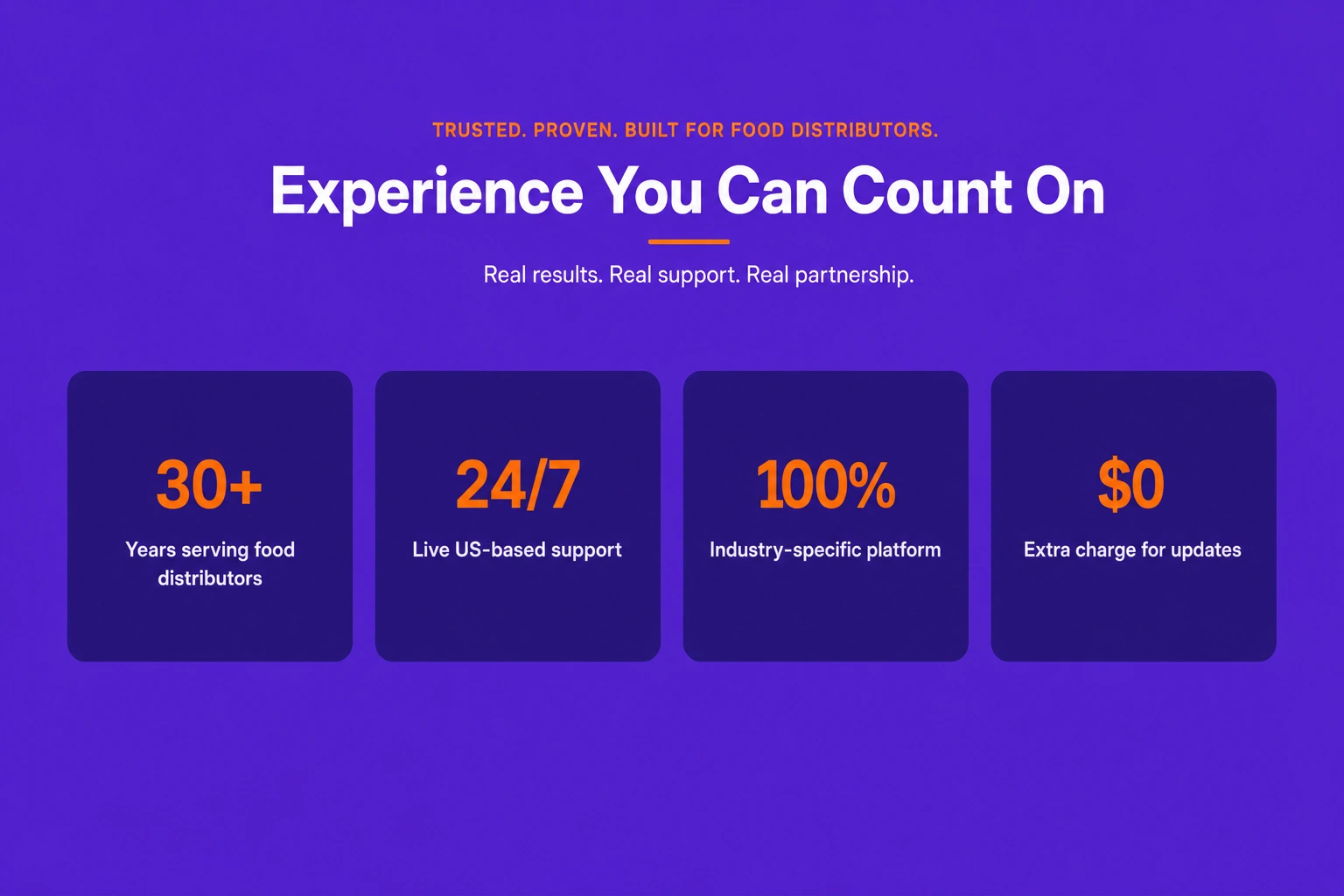
Features & grids · Feature counter Grid
Showcase key business statistics, milestones, or achievements using animated counter cards arranged in a clean and responsive grid layout.
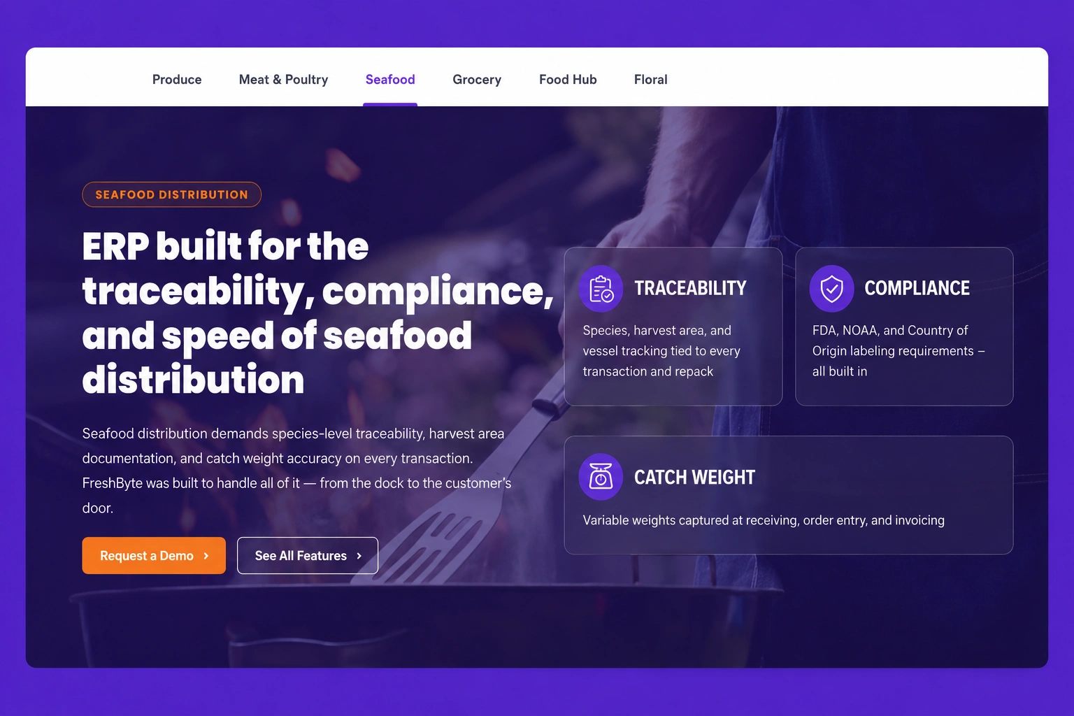
Features & grids · Feature Tab With Page
Display detailed feature information inside tabbed sections with dedicated page-style layouts, making complex content easy to organize and explore.

Galleries & media · Gallery grid
Present your photos, portfolio items, or product images in a structured gallery grid that creates a visually appealing and organized browsing experience.

Galleries & media · Masonry gallery
Showcase images in a modern masonry layout that automatically adjusts different image sizes while maintaining a clean and professional visual presentation.
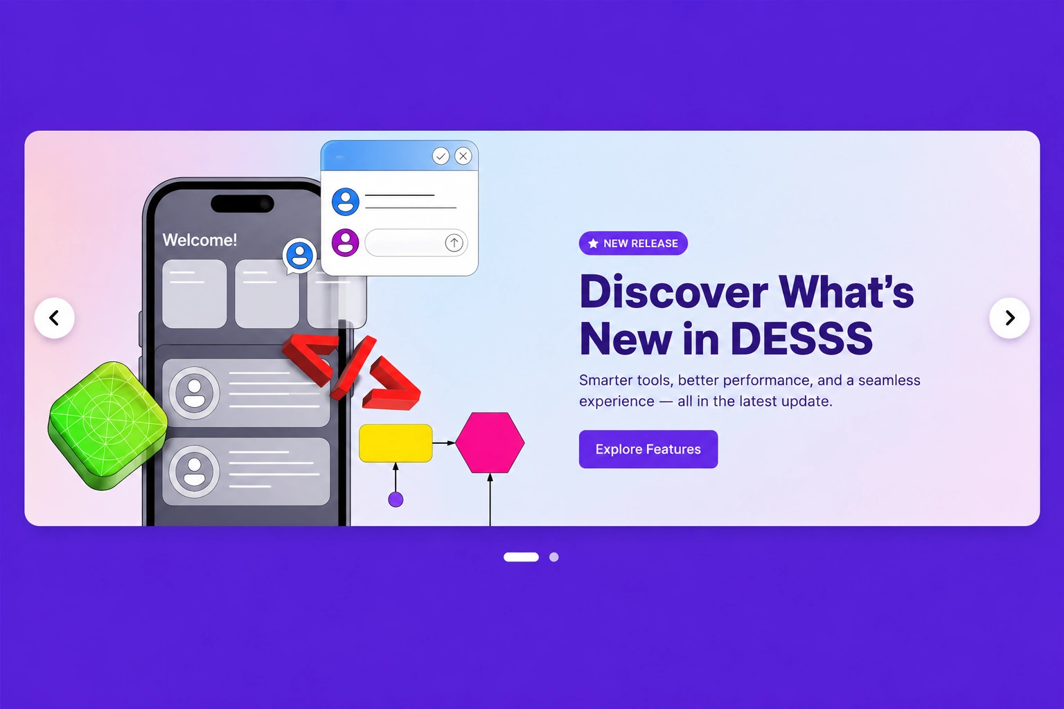
Galleries & media · Carousel
Display multiple images, products, or featured content inside an interactive carousel that encourages visitors to browse smoothly through each item.
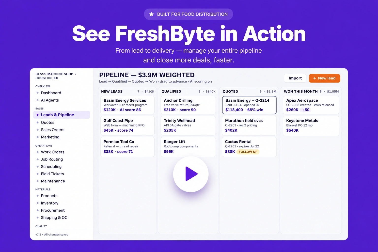
Galleries & media · Video block
Embed promotional videos, tutorials, demonstrations, or customer stories within a dedicated video section that increases engagement and improves storytelling.
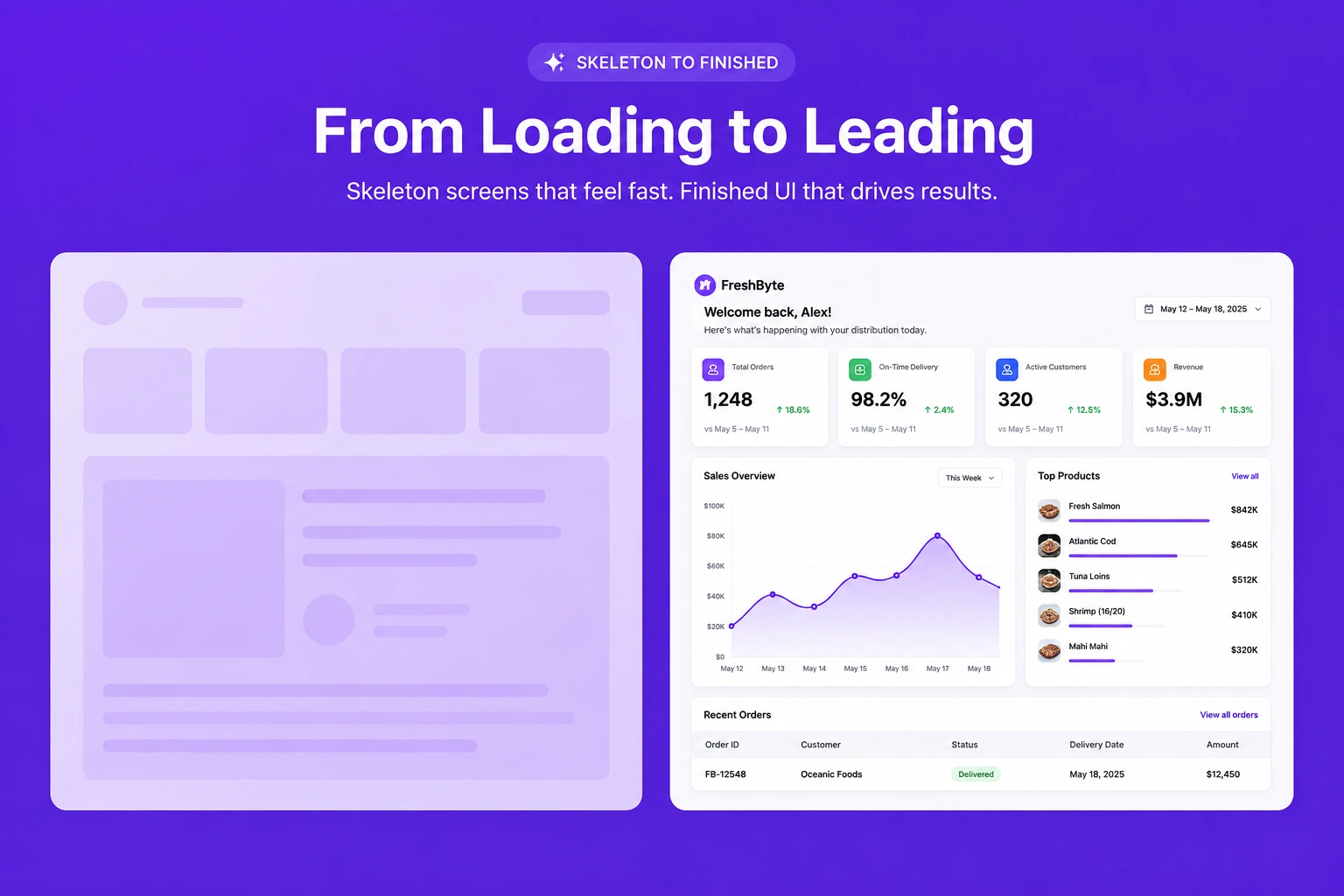
Galleries & media · Before / after
Compare before-and-after images side by side to effectively demonstrate transformations, improvements, or completed project results in a visually impactful way.

Galleries & media · Full-width banner
Create a stunning full-width banner that combines impactful visuals with compelling content to promote products, services, announcements, or special campaigns.
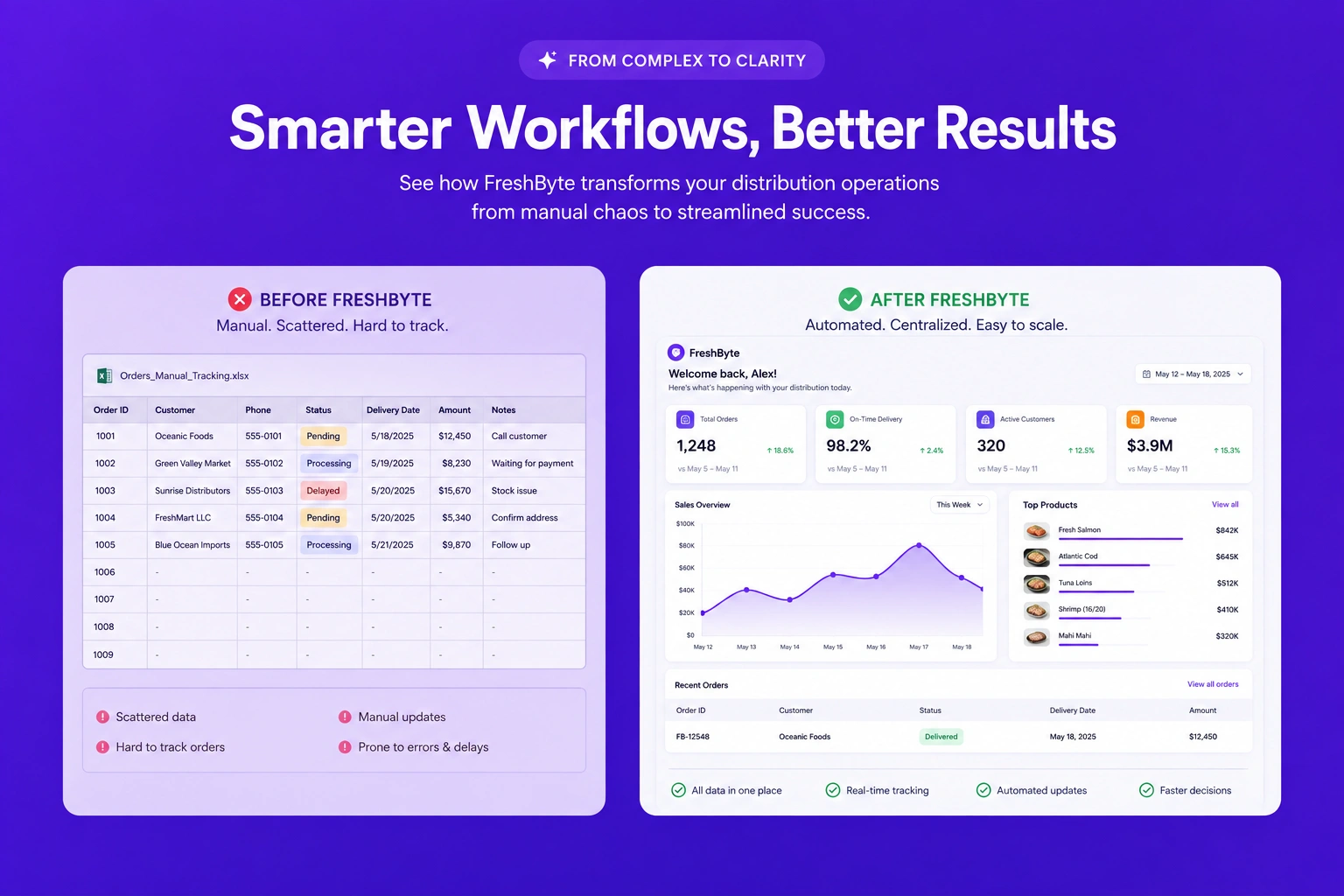
Galleries & media · Two-up images
Display two complementary images side by side with supporting content to effectively compare products, showcase projects, or tell a visual story.
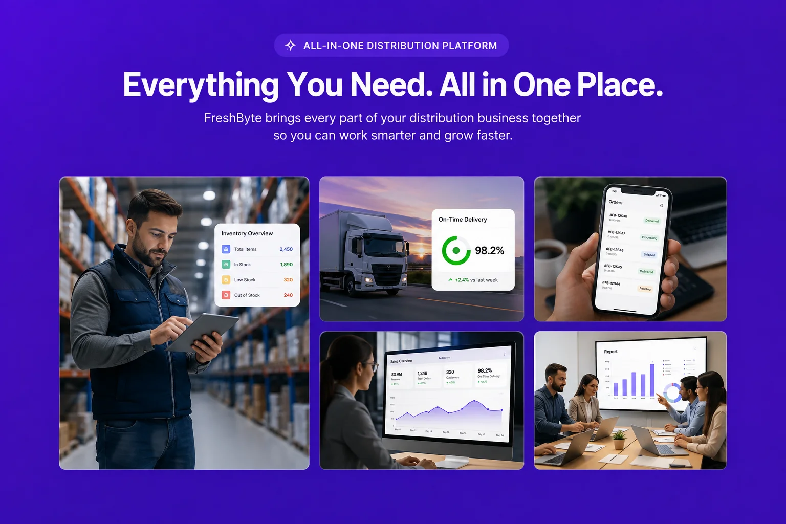
Galleries & media · Mosaic
Arrange multiple images in a modern mosaic layout that creates an engaging visual gallery while highlighting featured content creatively.
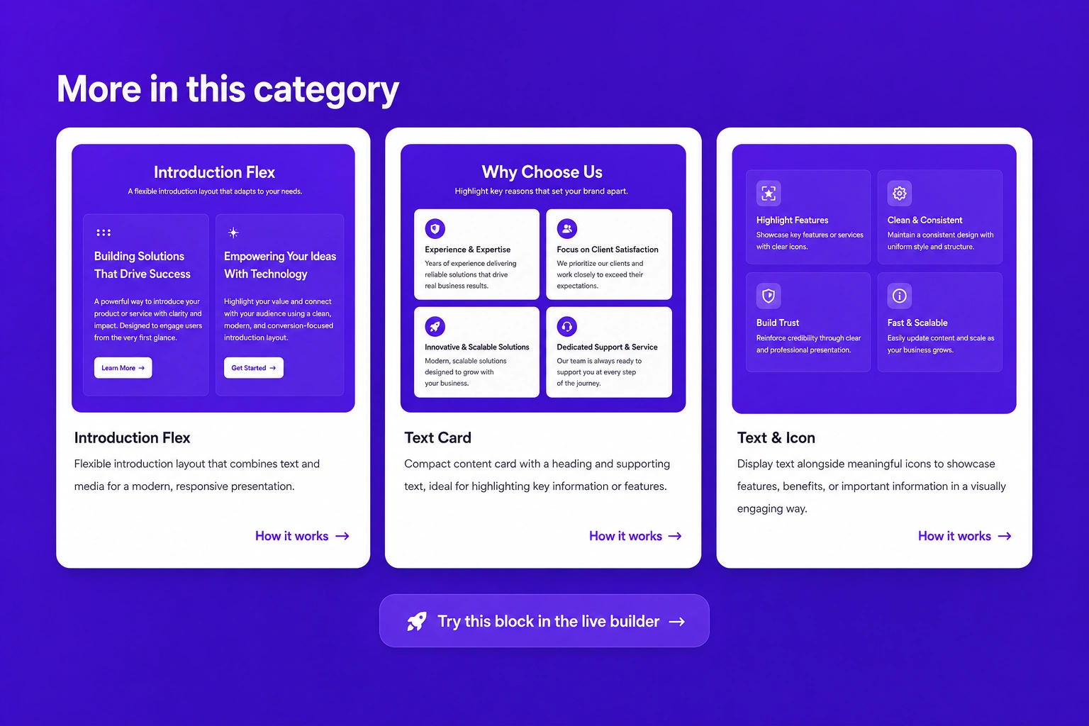
Galleries & media · Image with caption card
Showcase images alongside informative captions that provide additional context, helping visitors better understand your products, services, or portfolio.
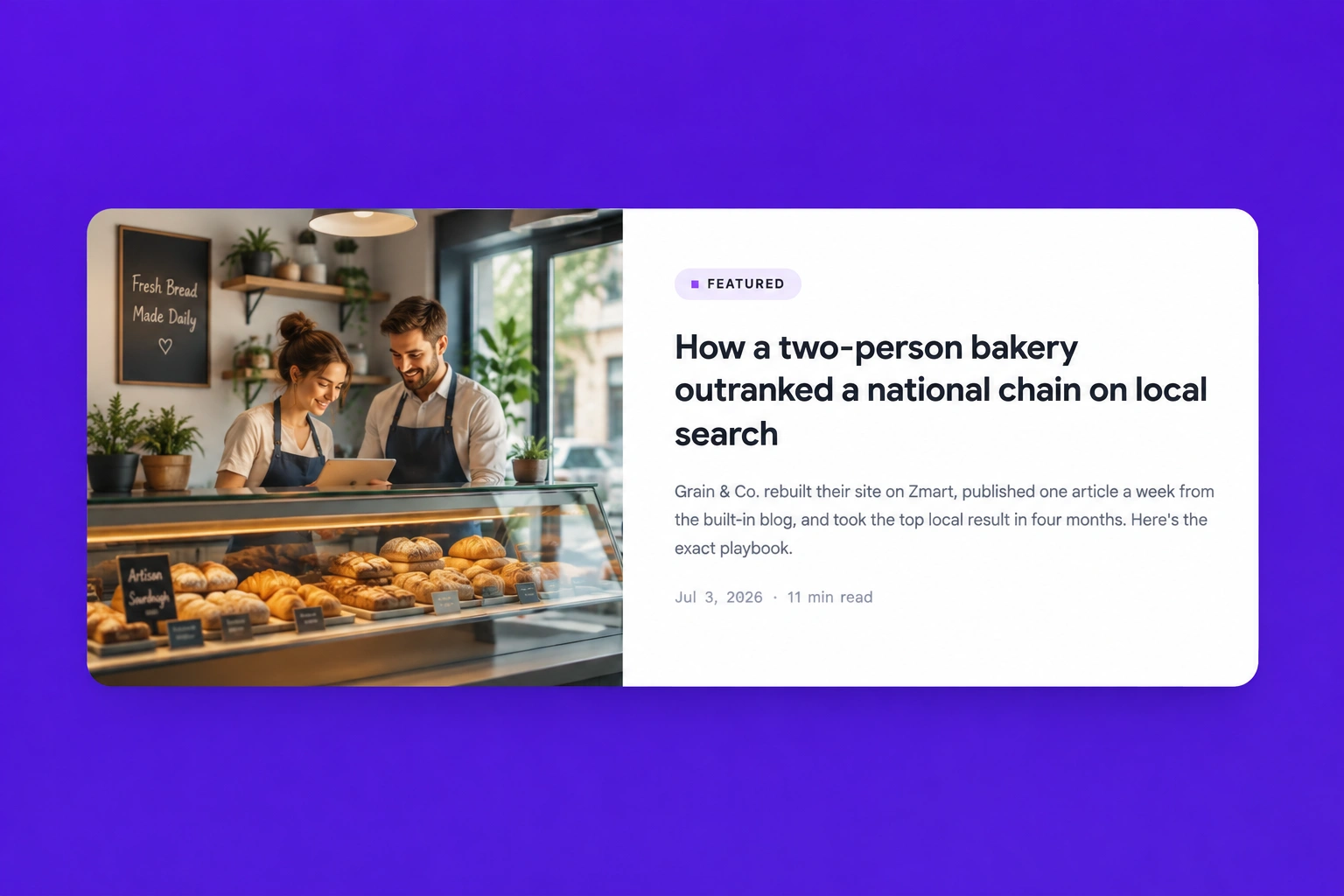
Galleries & media · Feature Horizontal Blog
Highlight featured articles or blog posts in a horizontal card layout with eye-catching images and concise descriptions that encourage users to read more.
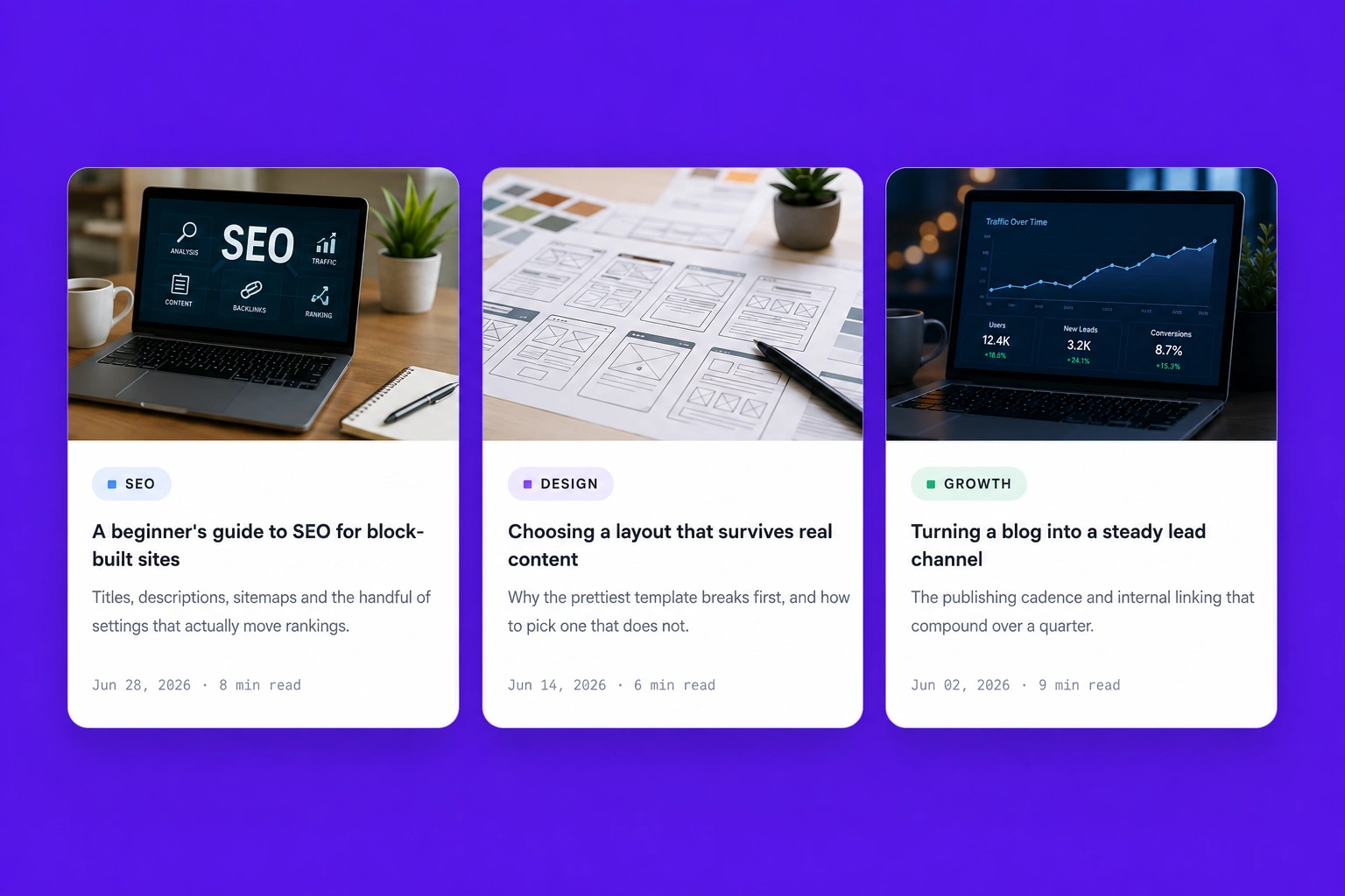
Galleries & media · Feature Vertical Blog
Display blog posts or news updates in a clean vertical layout that improves readability while making featured content easy to discover.
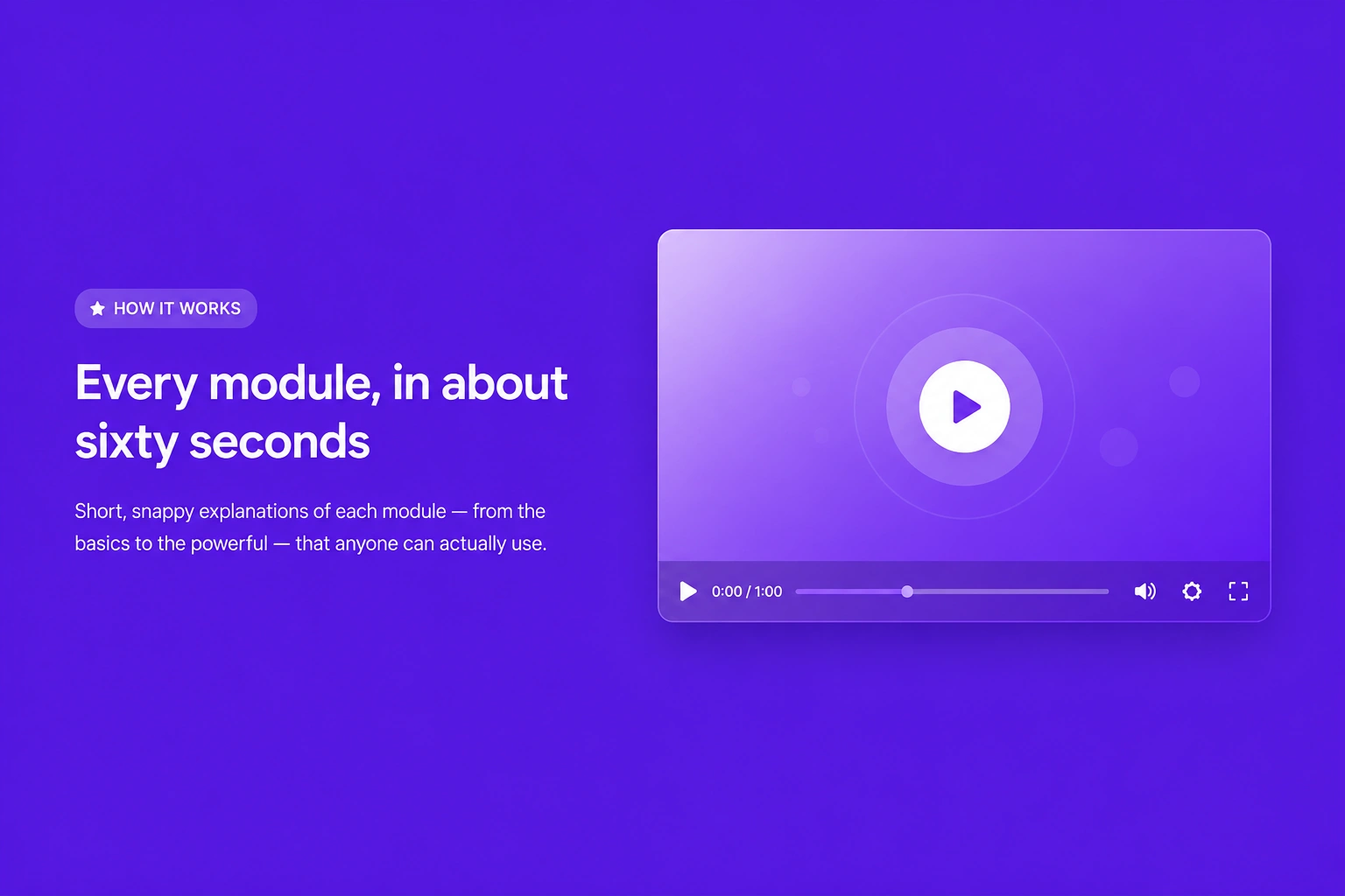
Galleries & media · Text and Video
Combine informative text with engaging video content to explain services, demonstrate products, or share valuable insights in a visually appealing format.
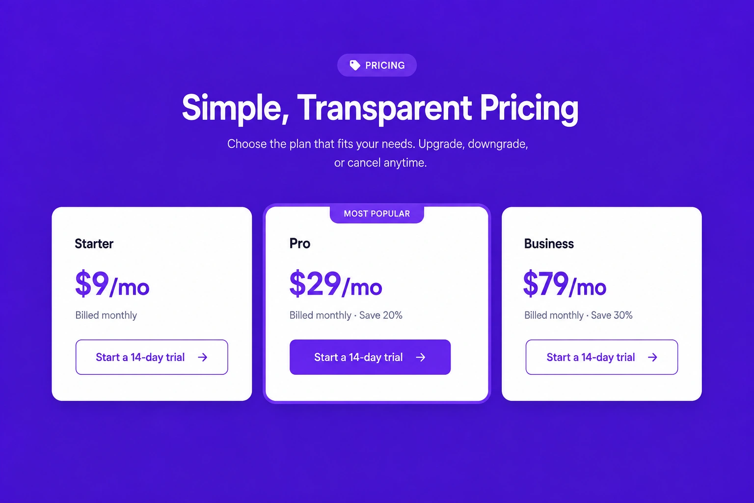
Pricing & CTAs · Pricing cards
Present pricing plans using attractive cards that clearly display features, benefits, and pricing details, helping customers compare options with confidence.
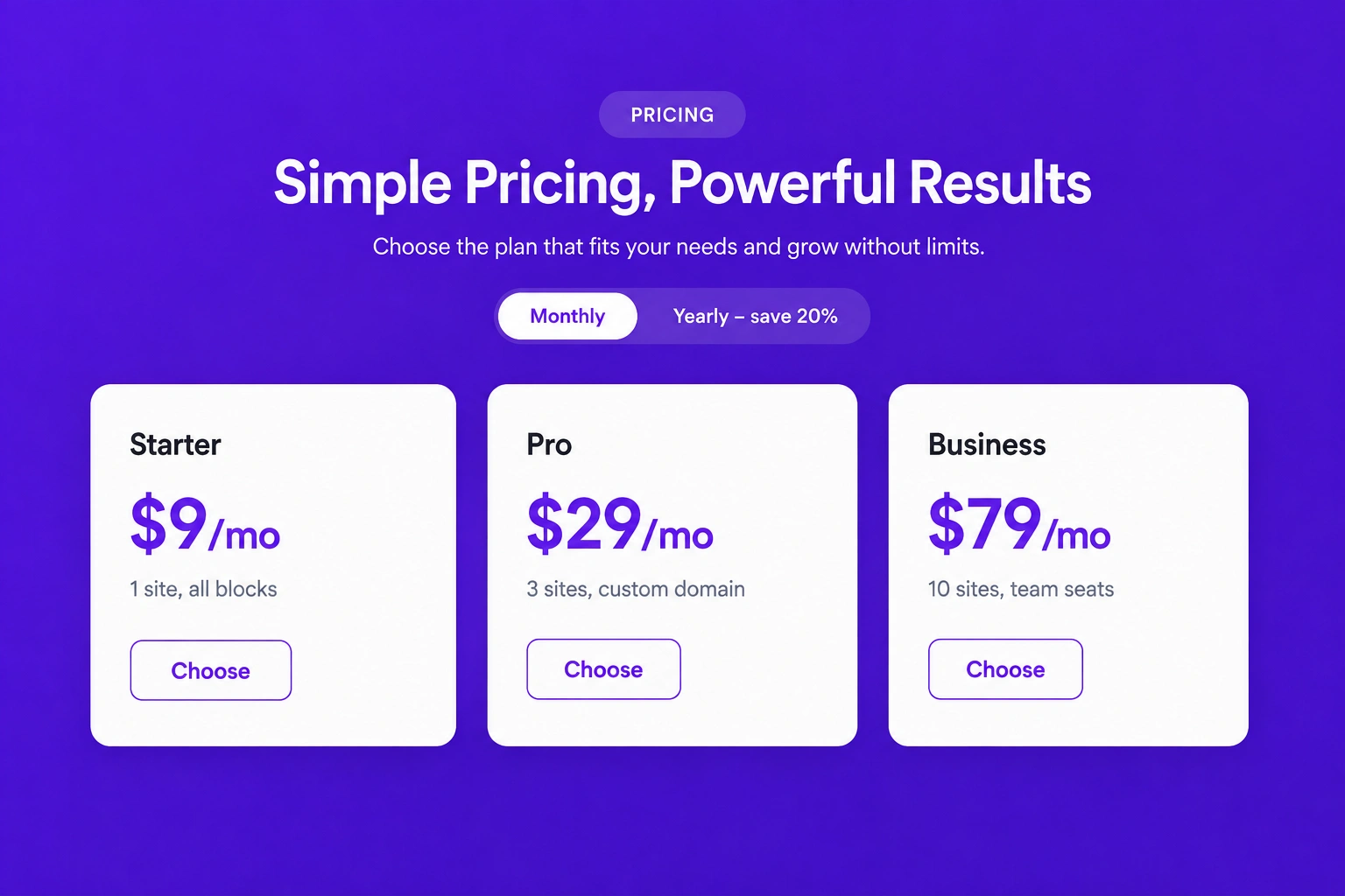
Pricing & CTAs · Pricing with toggle
Allow visitors to switch between monthly and yearly pricing plans using an interactive toggle, making plan comparison simple and convenient.
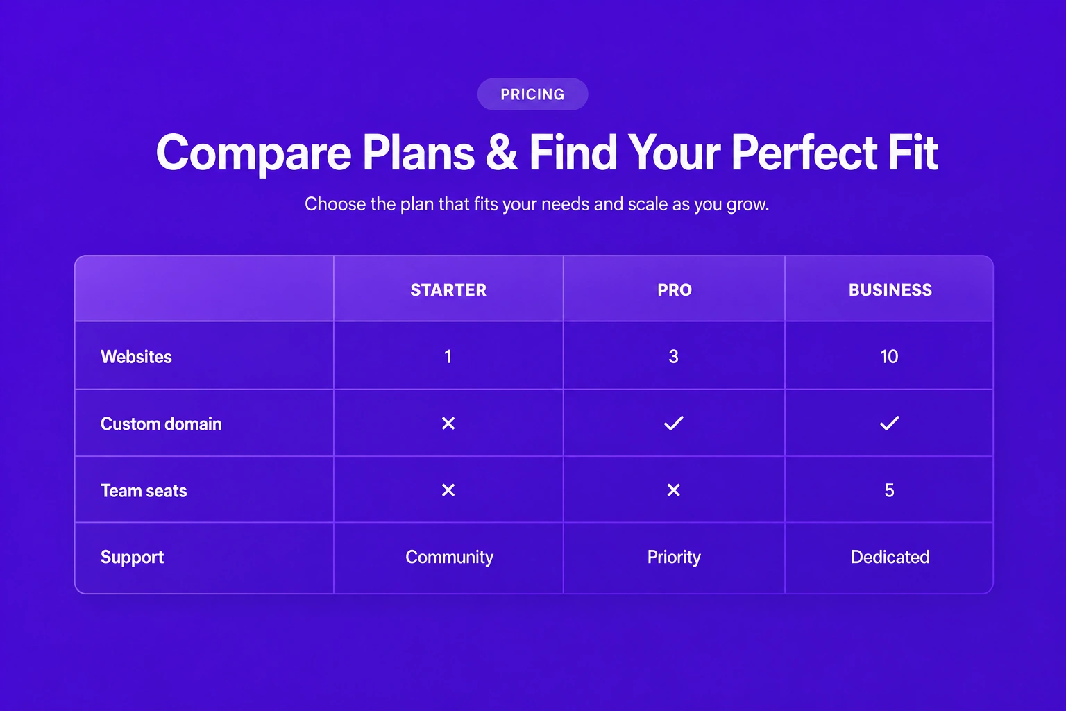
Pricing & CTAs · Pricing table
Compare multiple pricing plans side by side in a structured table that clearly highlights included features, pricing differences, and plan benefits.
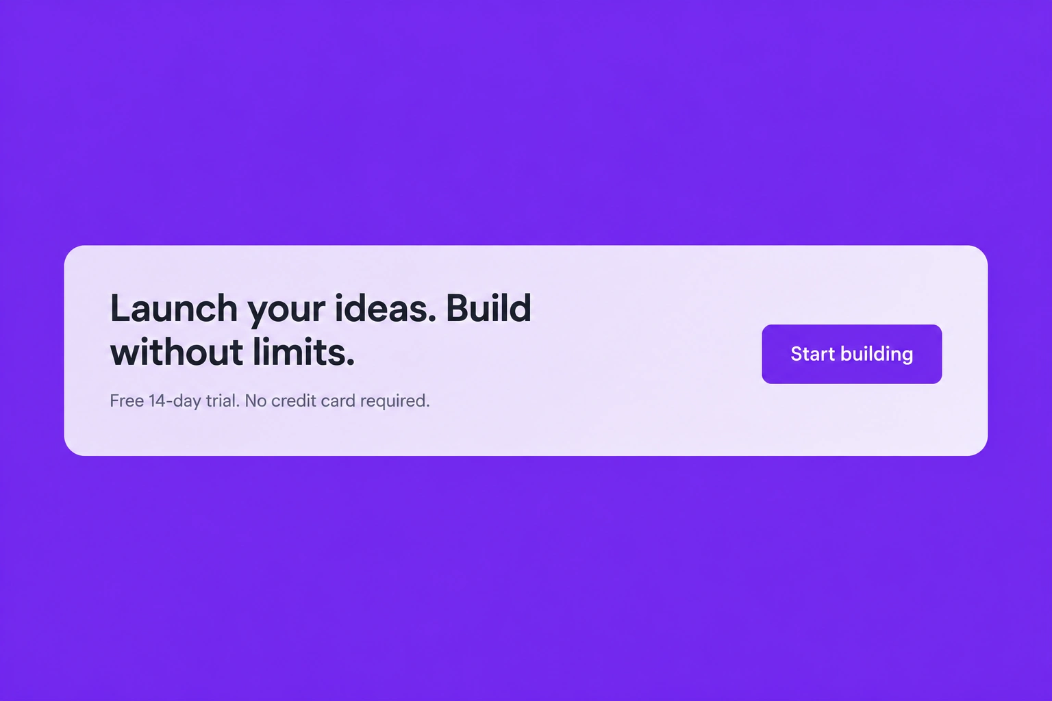
Pricing & CTAs · CTA banner
Encourage visitors to take immediate action with a bold call-to-action banner featuring persuasive messaging and highly visible action buttons.
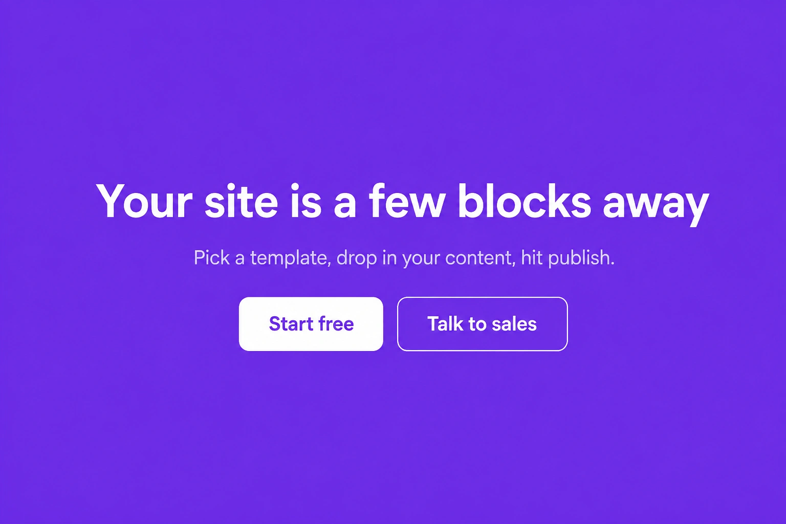
Pricing & CTAs · CTA centered
Present a focused call-to-action with centered content, compelling copy, and prominent buttons that drive visitors toward your desired conversion goal.
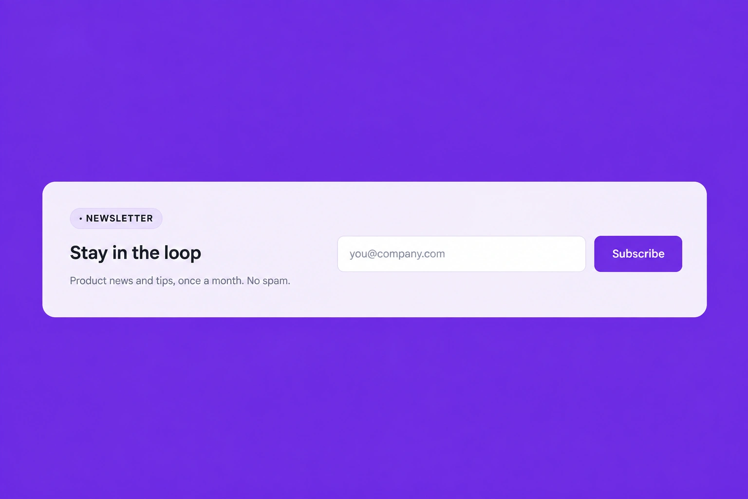
Pricing & CTAs · Signup strip
Capture leads with a clean and compact signup section that encourages visitors to subscribe, register, or join your platform with minimal effort.
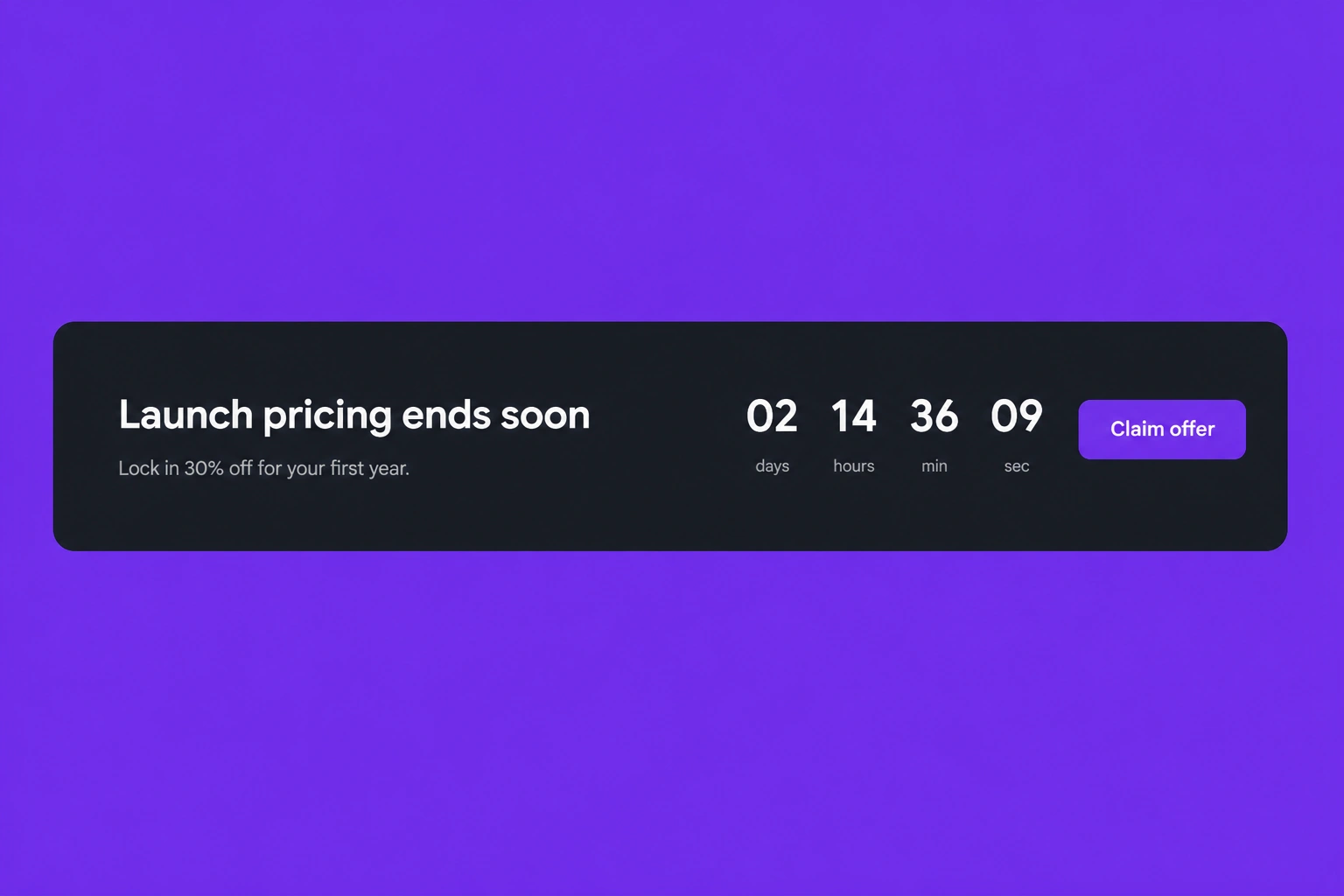
Pricing & CTAs · Countdown banner
Create urgency for limited-time promotions by combining promotional messaging with a live countdown timer that motivates visitors to act quickly.
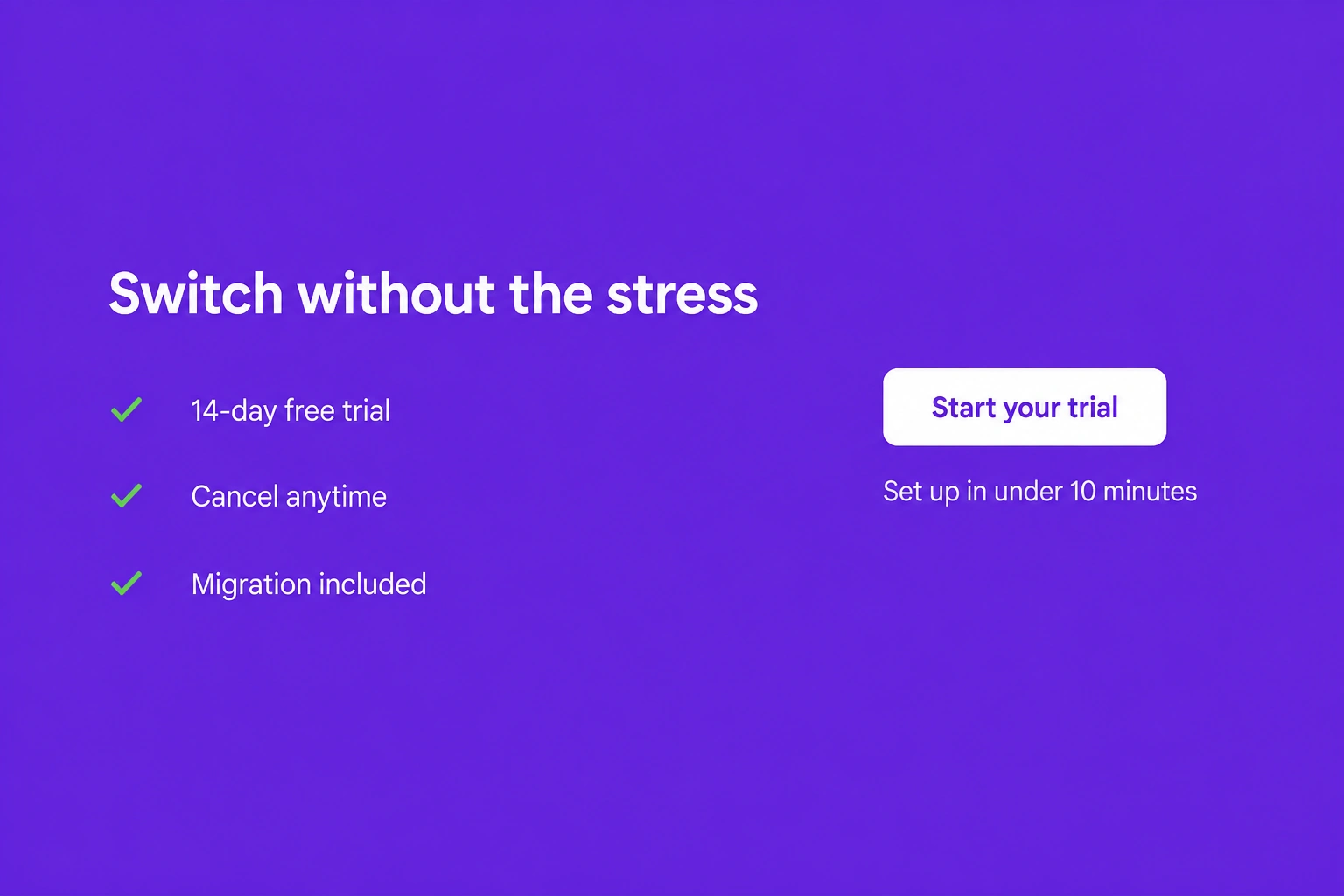
Pricing & CTAs · CTA with checklist
Combine persuasive call-to-action content with a checklist of key benefits or features, helping visitors understand the value before taking action.
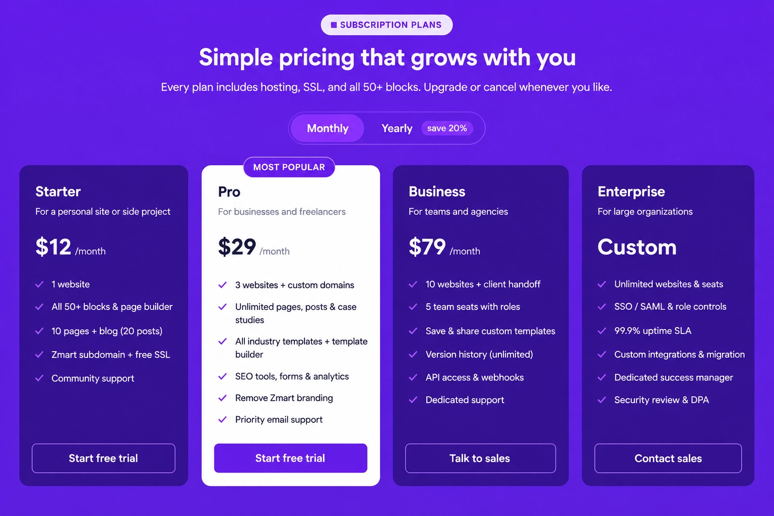
Pricing & CTAs · Pricing cards with tab
Display multiple pricing plans inside interactive tabs, allowing users to easily switch between categories while comparing available options.
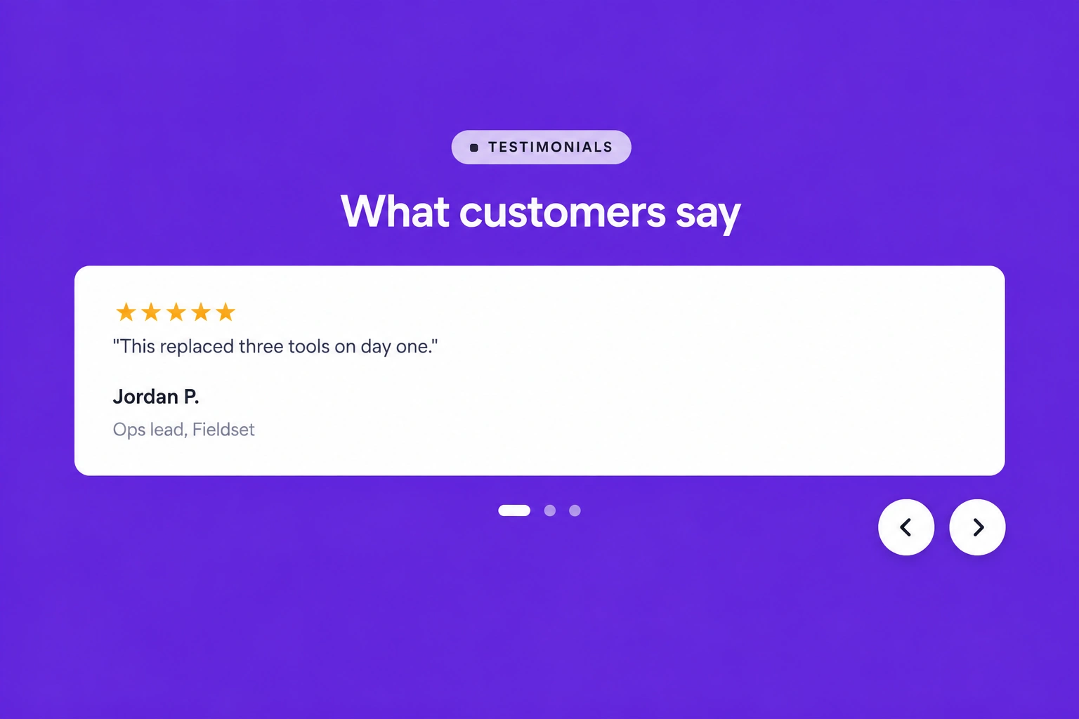
Testimonials & trust · Testimonial grid
Showcase customer testimonials in a structured grid layout that highlights positive experiences, builds credibility, and reinforces trust in your brand.
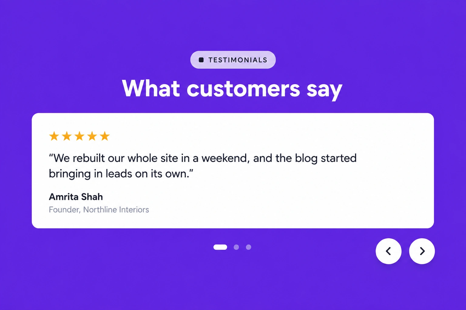
Testimonials & trust · Spotlight quote
Feature a powerful customer quote in a dedicated spotlight section that emphasizes success stories and creates a strong impression on potential clients.
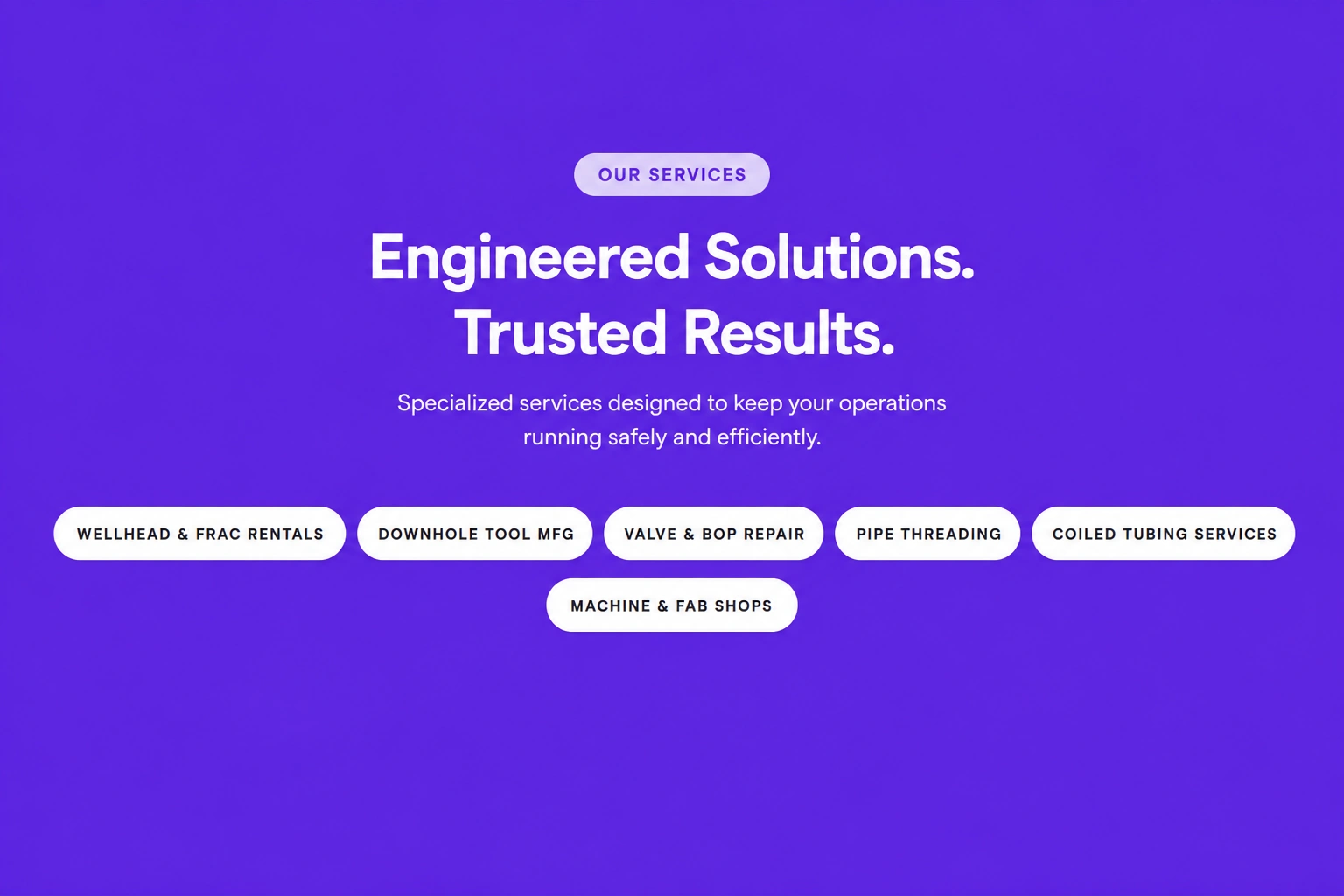
Testimonials & trust · Logo strip
Display client, partner, or certification logos in a clean horizontal strip that strengthens brand credibility and demonstrates industry recognition.
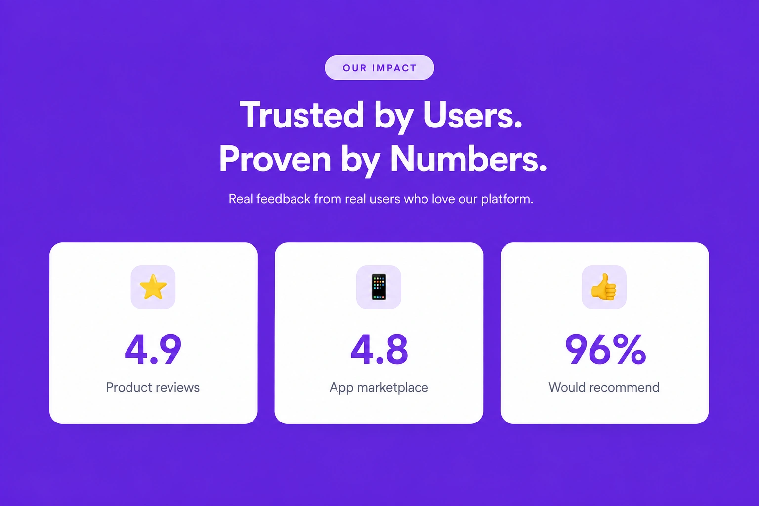
Testimonials & trust · Ratings row
Present customer ratings, reviews, and satisfaction scores in a simple horizontal layout that provides instant social proof and builds visitor confidence.
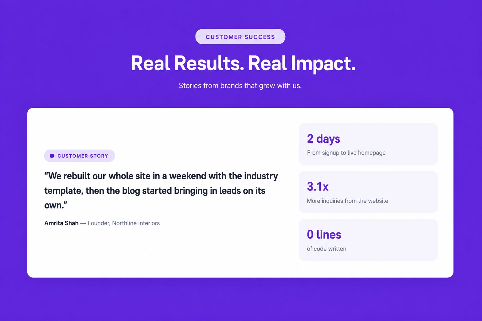
Testimonials & trust · Case study card
Highlight successful customer projects with detailed case study cards that showcase measurable results, challenges, and business outcomes.
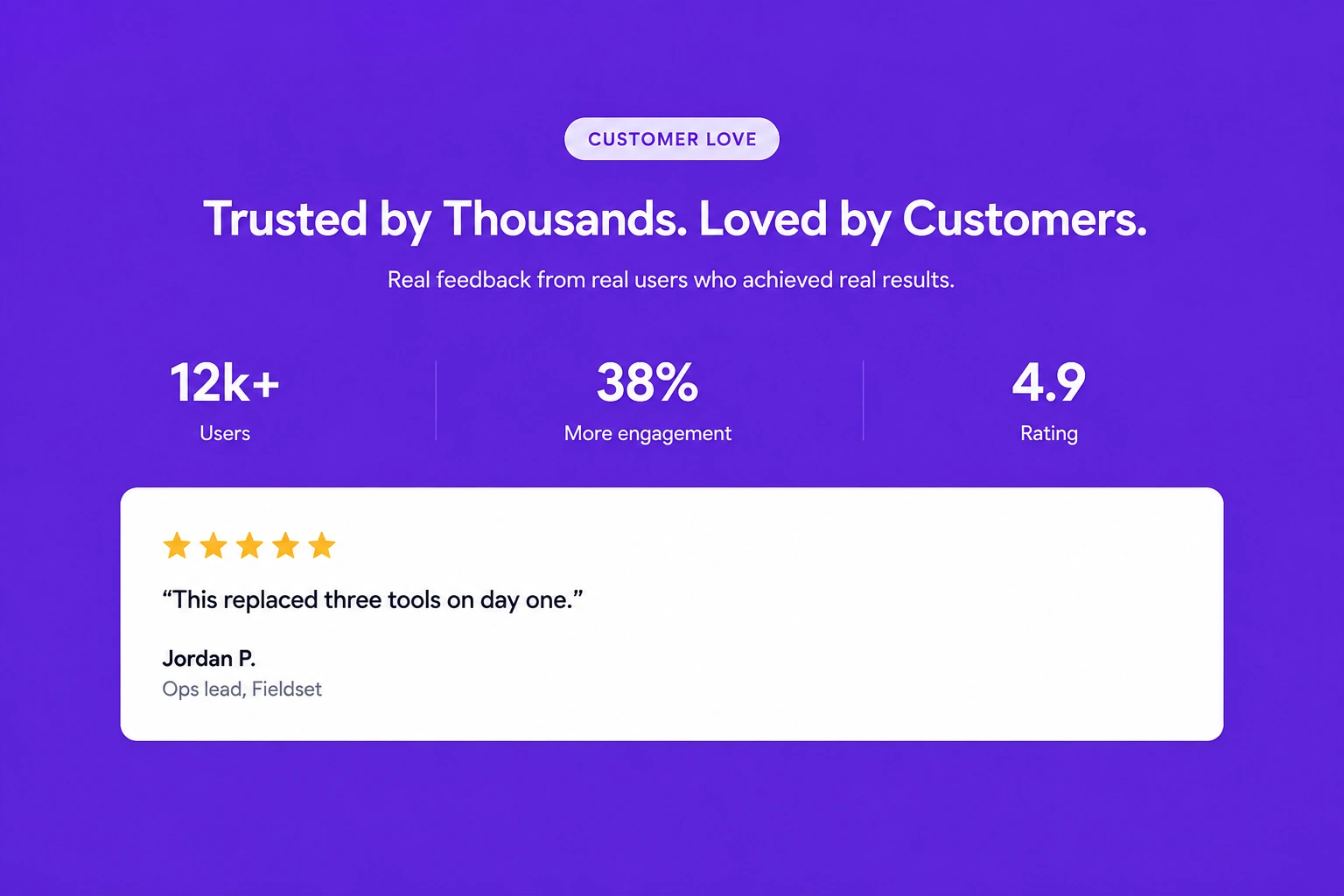
Testimonials & trust · Stats and quote combo
Combine impressive business statistics with authentic customer quotes to reinforce trust, demonstrate success, and support your value proposition.
Testimonials & trust · Press mentions
Showcase media coverage, industry publications, or featured press mentions to strengthen credibility and demonstrate recognition from trusted sources.
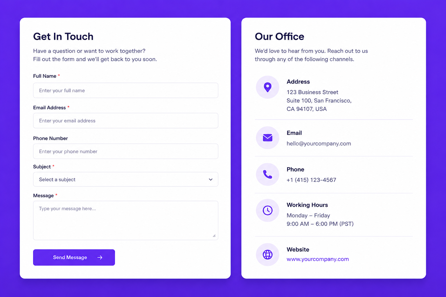
Form
Provide an easy-to-use contact form alongside complete office information, allowing visitors to quickly send inquiries and connect with your team. Include fields for name, email, phone number, subject, and message, with office address, email, phone, business hours, and website details displayed for convenient communication.